POP THE CORN
PROJECT: Brand Identity Design
DELIVERABLES: Logo Design/Packaging/OOH Advertising
TIMELINE: 1-2 WEEKS
Project Type: Creative Concept Work
Awards & Recognition:

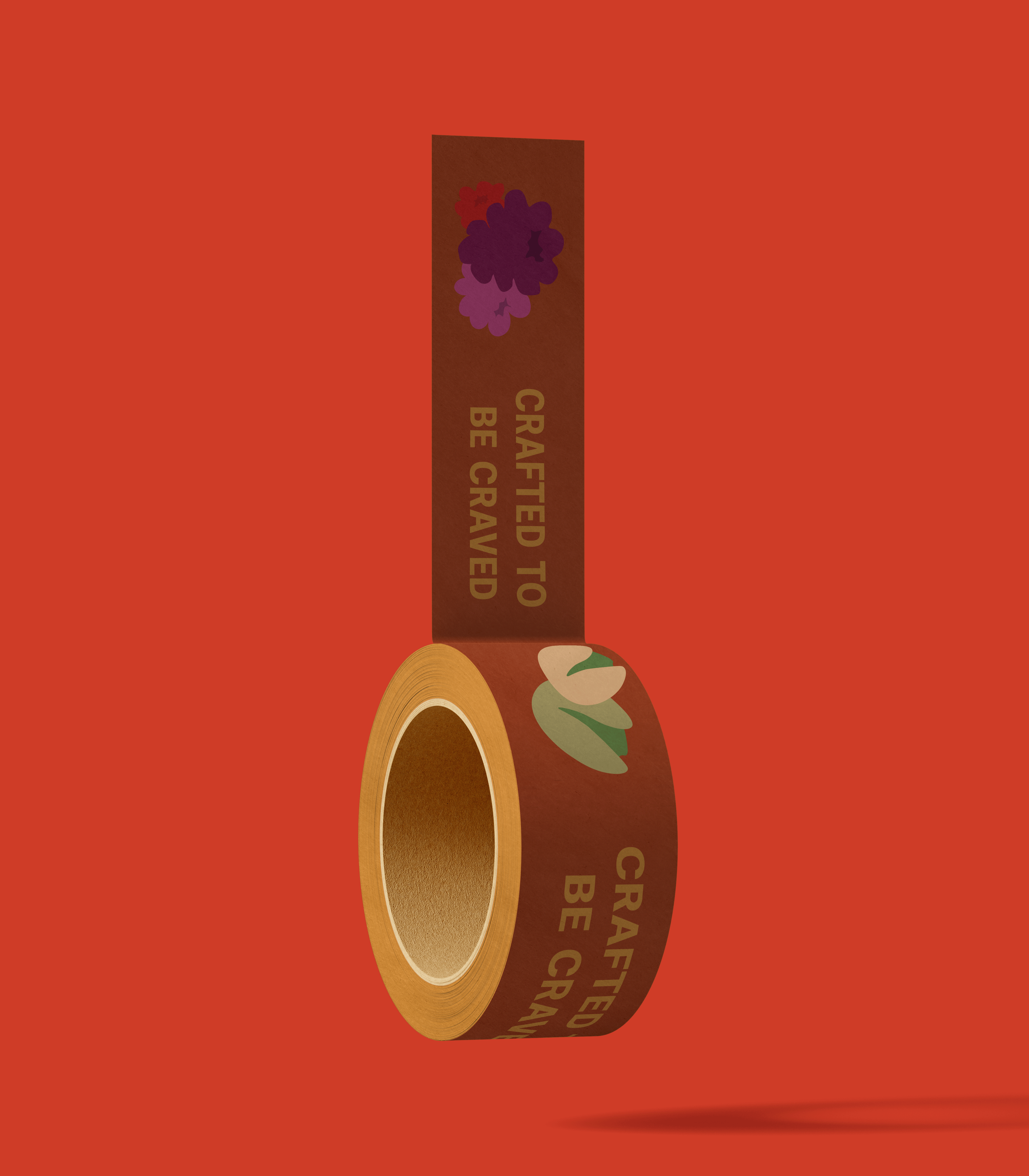
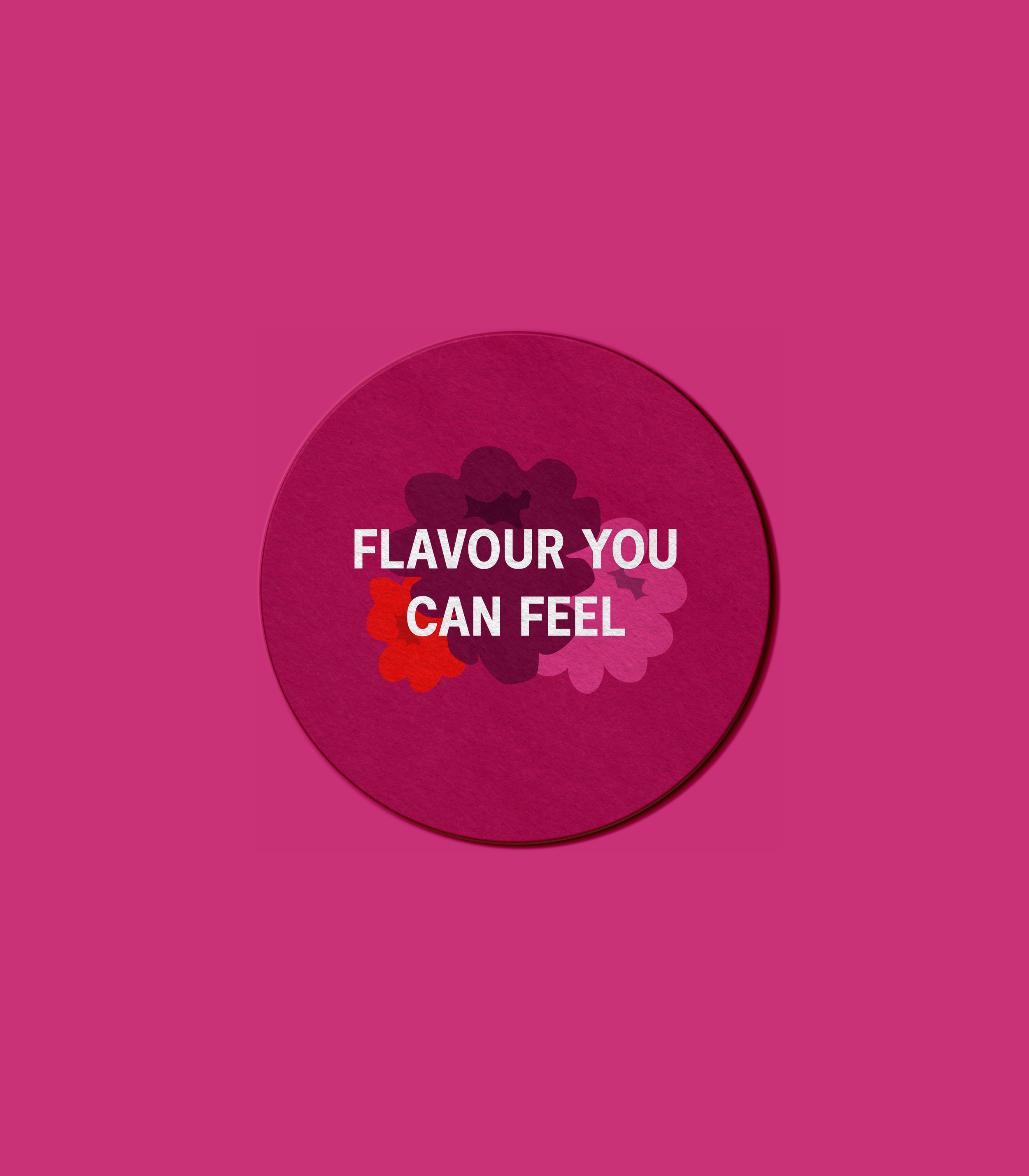
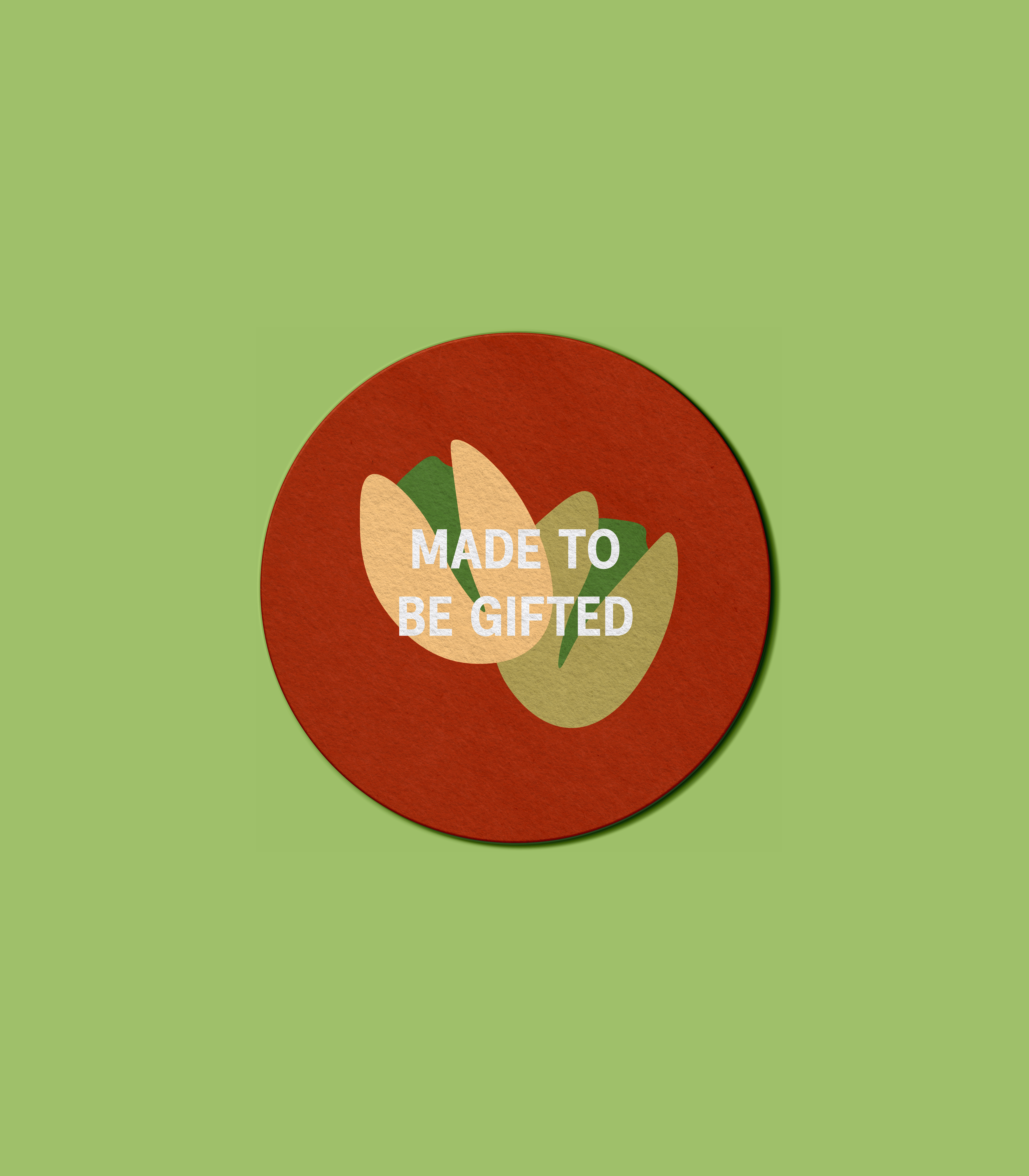
PoptheCorn is a conceptual French gourmet popcorn brand created to challenge the idea that popcorn has to feel ordinary. My goal with this project was to reimagine a familiar snack as something more elevated, playful, indulgent, and worthy of being treated like a premium product. Rather than positioning popcorn as a quick, disposable treat, I wanted it to feel gift-able, collectable, and experience-driven.
This project gave me the opportunity to explore how far thoughtful branding and packaging design can push everyday products. It wasn’t just about designing a visually striking packaging, it was about building a full brand world that made popcorn feel intentional, expressive, and confidently different.
A HEALTHY DOSE OF RULEBREAKING
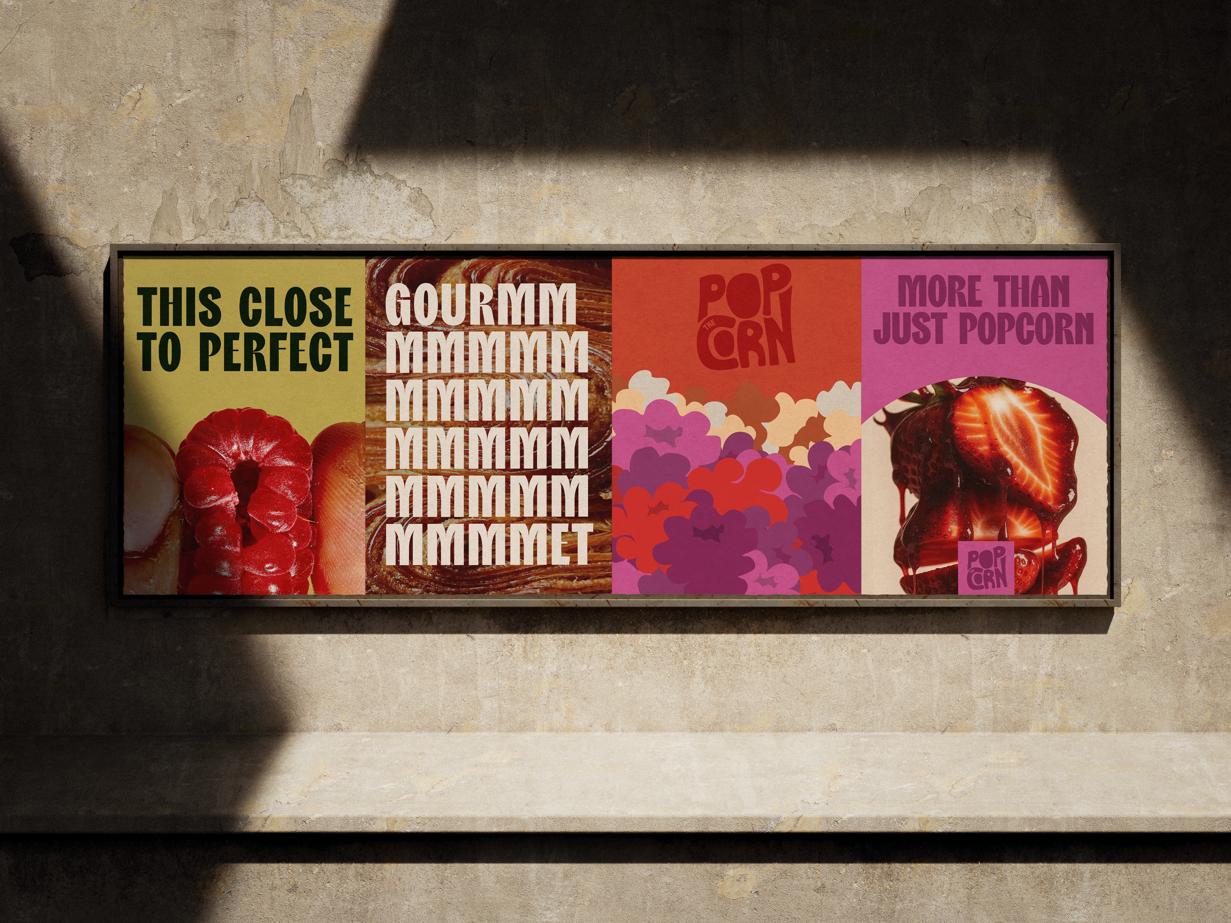
What made Pop the Corn really intriguing was striking a balance between premium and playful. Gourmet food branding often leans heavily into minimalism and restraint, while snack brands tend to prioritise boldness and fun. The challenge was to create something that sat comfortably between the two; refined enough to feel boutique, yet playful enough to remain approachable and fun.
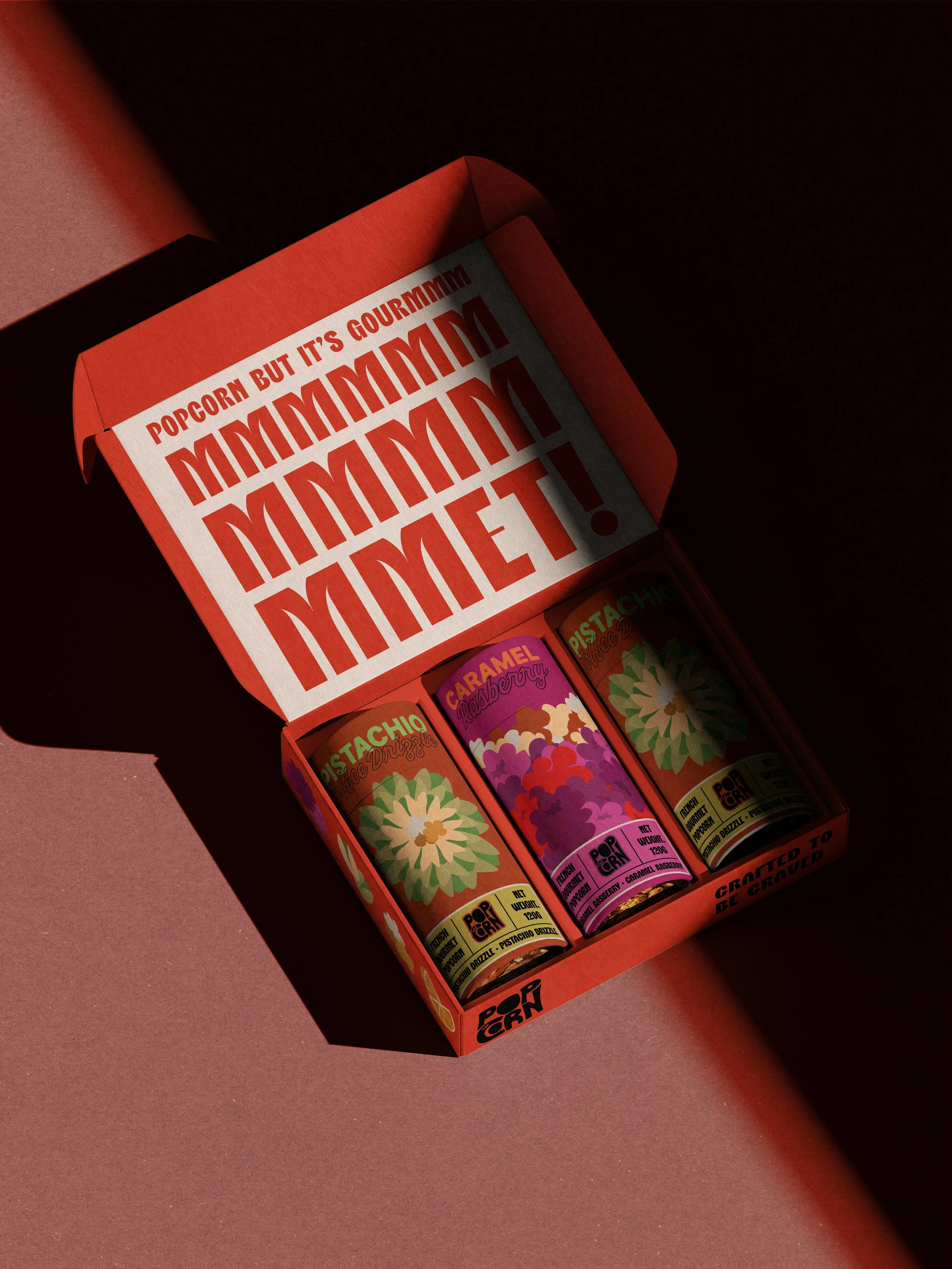
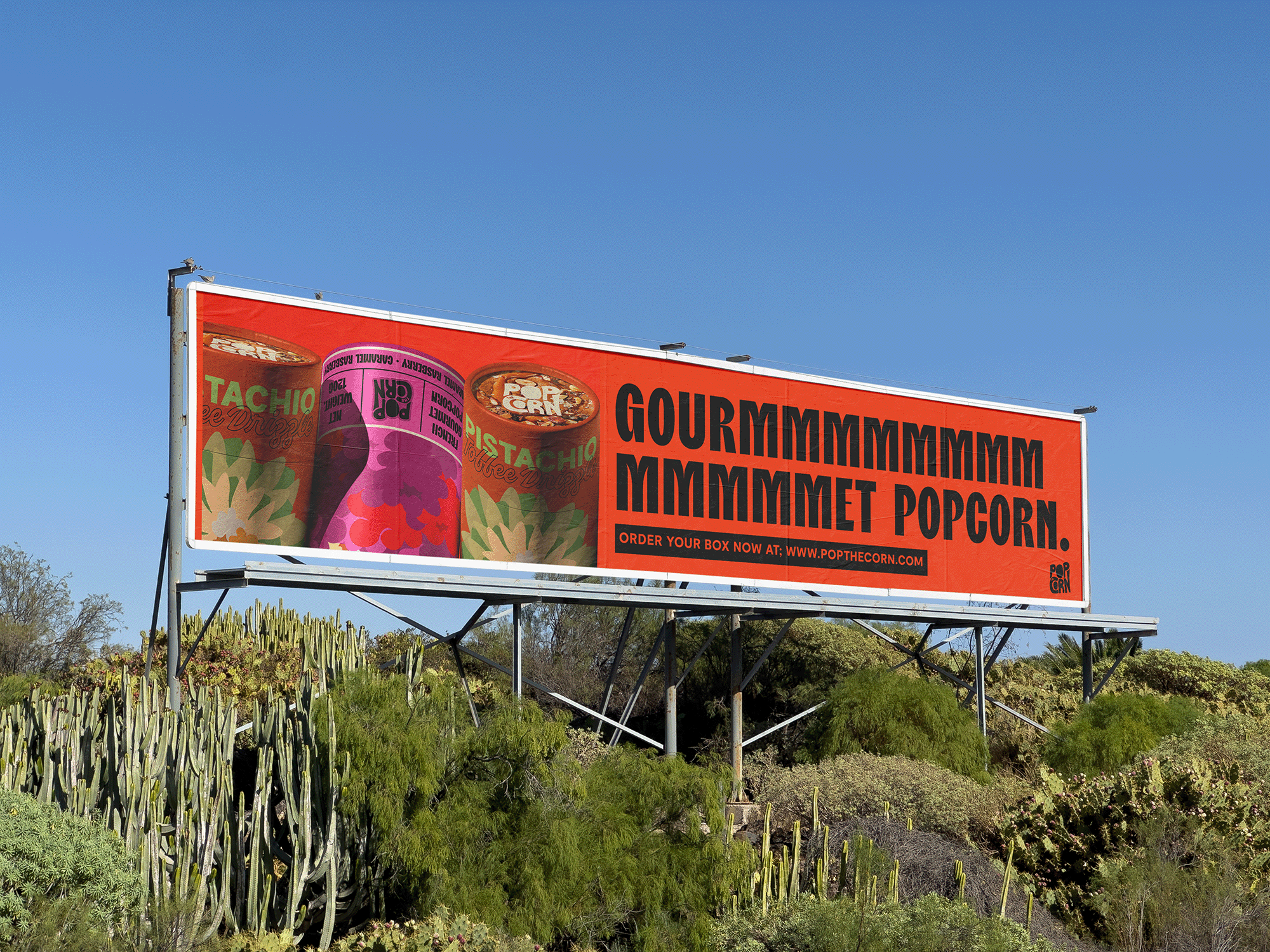
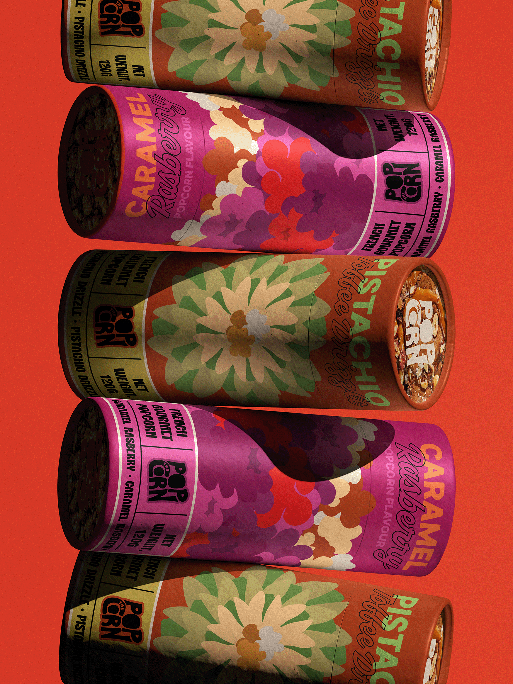
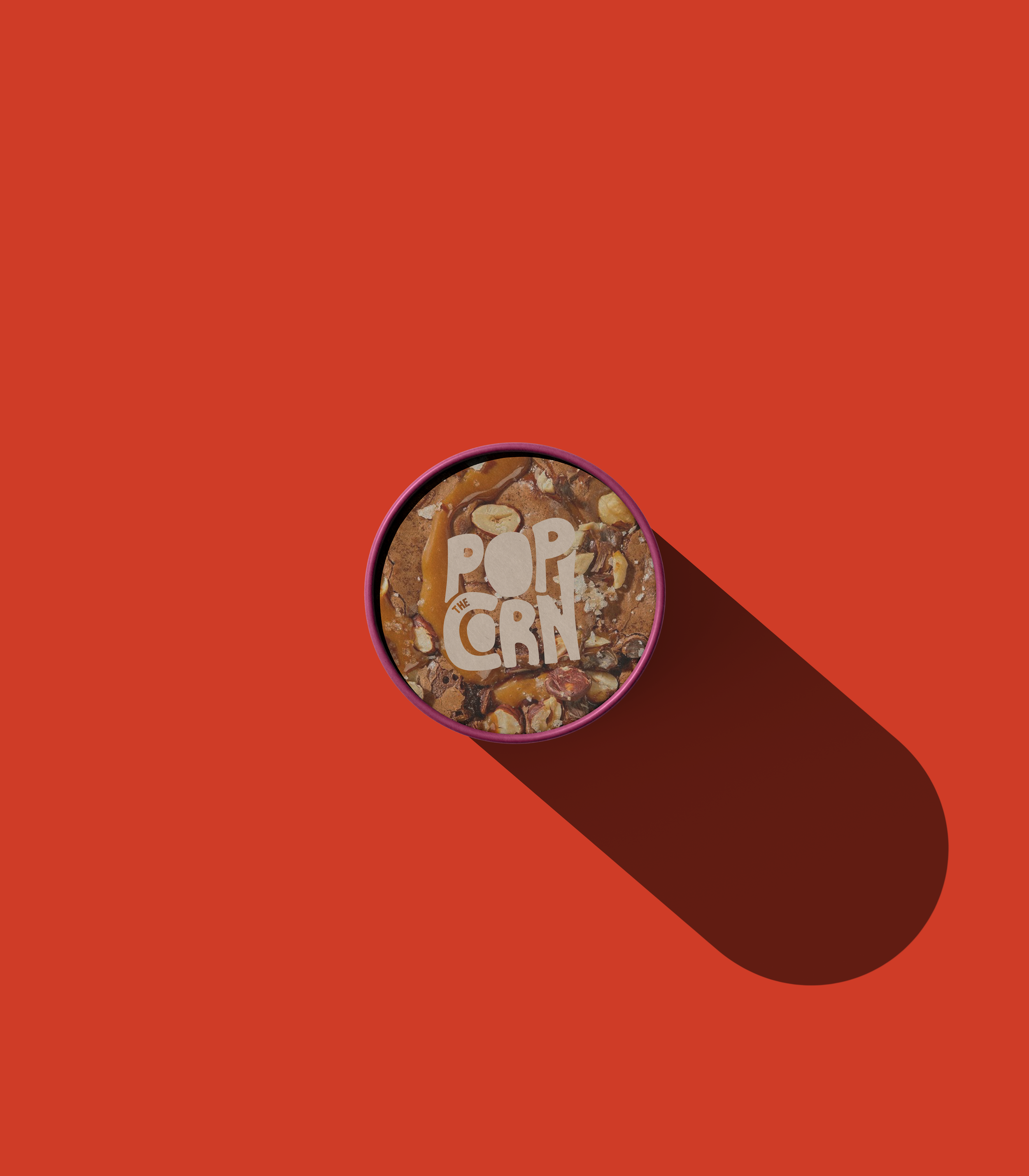
A key challenge was breaking away from the traditional popcorn formats and visual language. Most popcorn packaging relies on buckets, plastic bags, loud photography, and predictable colour schemes. I wanted PoptheCorn to immediately stand apart on the shelf, which led to the decision to use cylindrical tube packaging; a format more commonly associated with speciality chocolate, coffee, or patisserie goods. This shift alone helped reposition the product before any graphics were applied.
NEVER SETTLING FOR THE EASY WAY OUT
Another important consideration was flavour storytelling. Rather than applying the same visual treatment across every flavour, I treated each one as its own mini identity. The raspberry flavour is vibrant and expressive, using layered illustrations to convey sweetness and energy, while the pistachio flavour adopts a more refined, artisanal feel through a floral-inspired composition. This allowed the brand to feel varied and dynamic, while still remaining cohesive as a system.
BUILT TO DISRUPT THE POPCORN INDUSTY
Subtle details played an important role in grounding the design. The flavour photography on the cap, restrained bottom labelling, and minimal informational copy were all intentional choices to avoid clutter and maintain a refined feel. These quieter moments help elevate the overall experience, allowing the product to speak for itself.
Overall, this project allowed me to explore a new perspective on how strategic design decisions can transform a familiar product into something memorable. By breaking a few popcorn industry standards and thinking of new ways to tell a story visually, this project sets out to a great example on how sometimes, just sometimes trying out ideas that sound crazy can lead to a truly unique outcome.