URBAN VISION
PROJECT: Brand Identity Design
DELIVERABLES: Logo Design/Branding/Signage/Web Design
TIMELINE: 1-2 WEEKS
Urban Vision is a conceptual architecture studio created to challenge the idea that architectural branding has to feel cold and corporate. My goal with this project was to reimagine a firm’s identity as more raw, intelligent, and intentionally defiant. Rather than positioning the studio as another standard service provider, I wanted it to feel like a high-energy, "urban hacker" force that views the city as a playground for strategic rebellion.
This project gave me the opportunity to explore how far a "rebellious" visual language can push a traditionally prestige-driven industry. It wasn’t just about creating a sharp logo; it was about building a full brand world that made architecture feel visceral, expressive, and confidently different. This project gave me the opportunity to explore how far a "rebellious" visual language can push a traditionally prestige-driven industry. It wasn’t just about creating a sharp logo; it was about building a full brand world that made architecture feel visceral, expressive, and confidently different.
A LOGO THAT CHALLENGES THE NORMS OF ARCHITECTURe
The primary challenge was to break away from the "minimalist luxury" that dominates modern architecture branding. Most firms opt for thin sans serifs and muted tones to convey prestige, but Urban Vision needed to feel more active and disruptive. The goal was to find a way to communicate "precision" through a "rebellious" lens, ensuring the studio felt professional enough to trust with a multi-million-pound project, but bold enough to offer something entirely different.
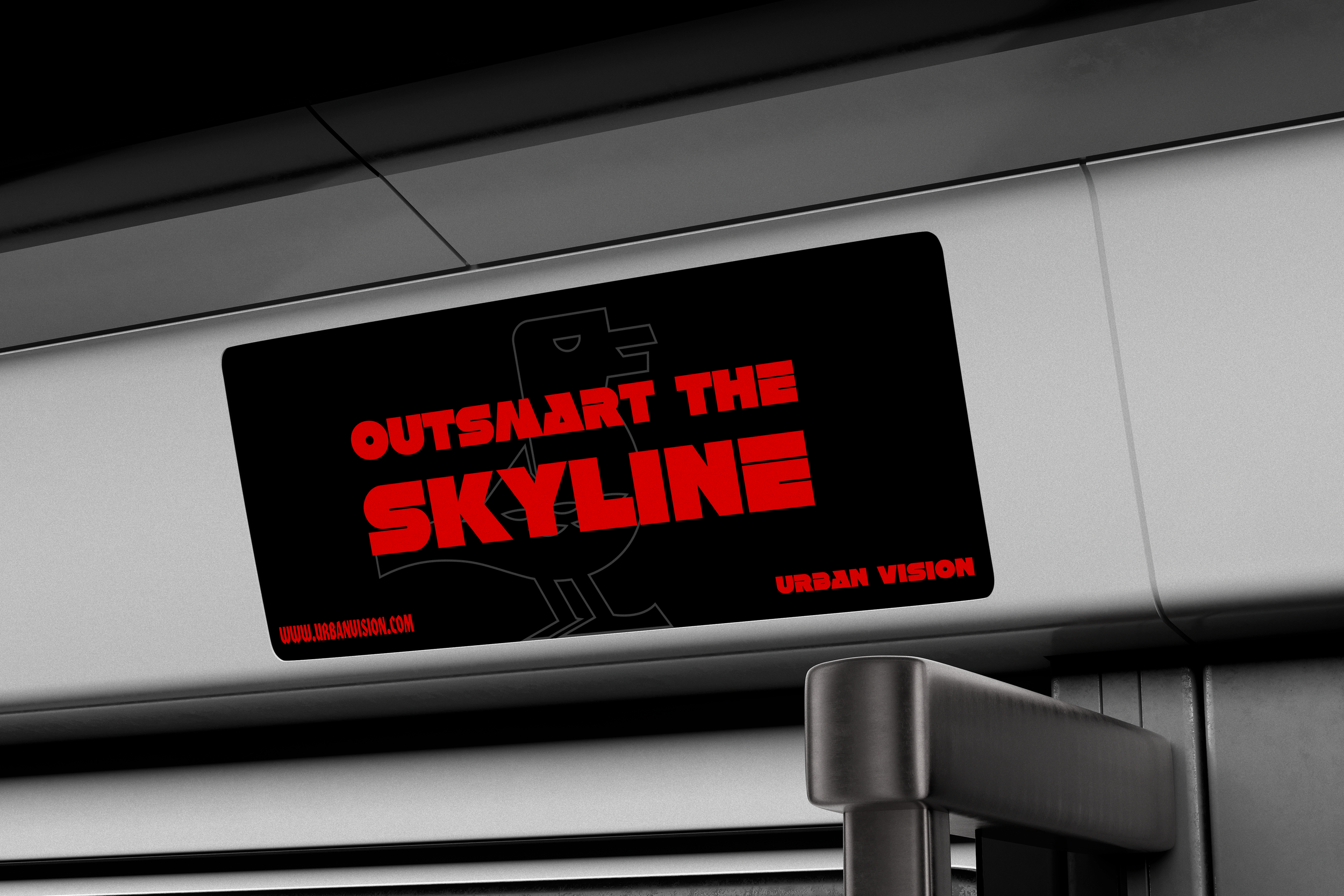
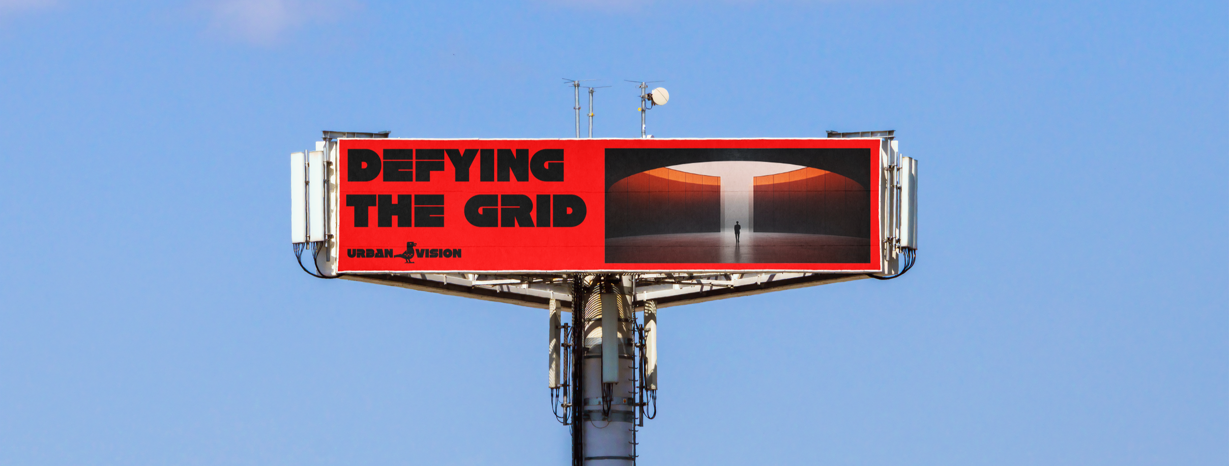
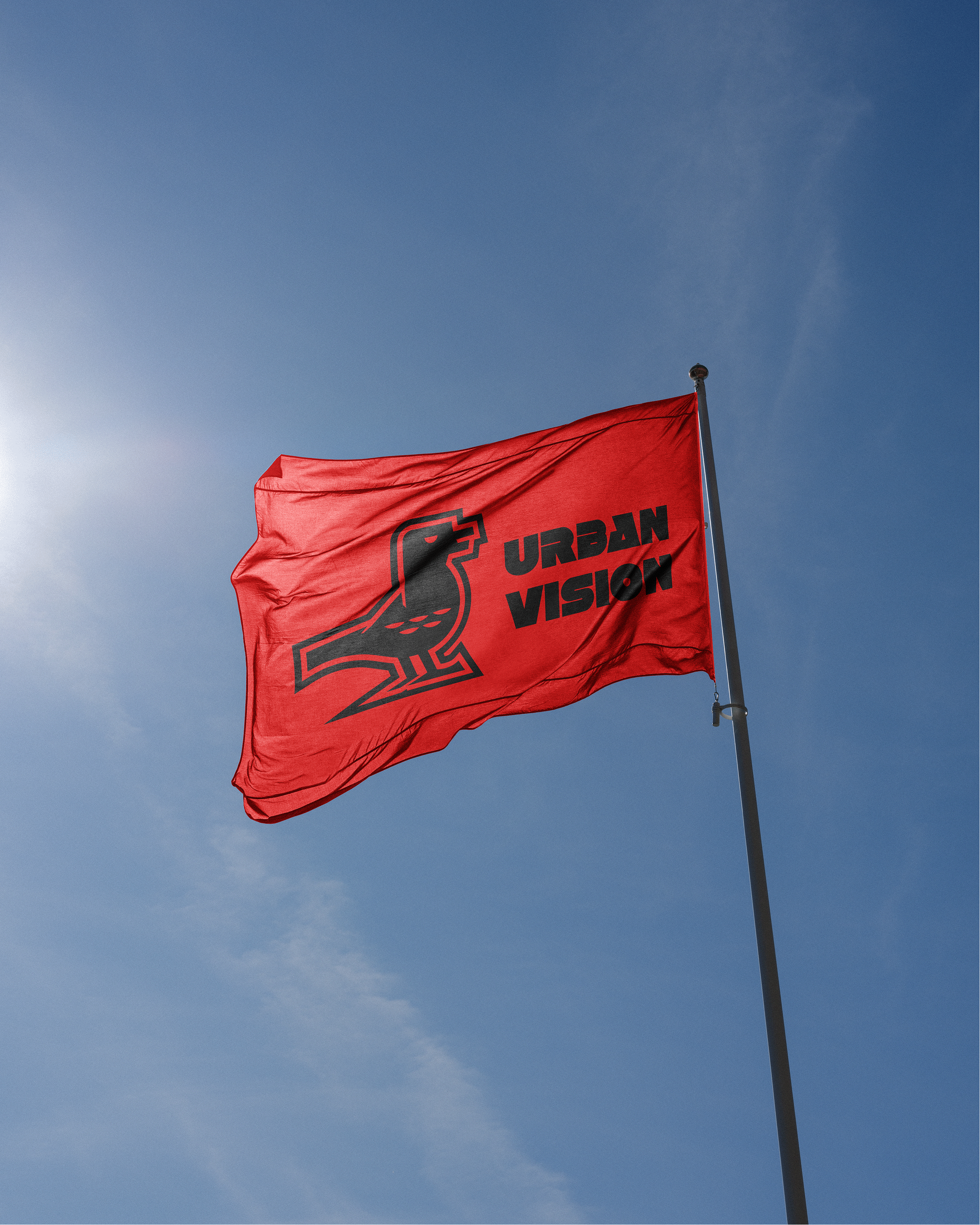
Beyond the logo, we needed a system that felt native to the city. This meant moving away from clean white backgrounds and embracing a high-contrast palette of Obsidian Black and Riot Red. This choice was deliberate, mirroring the language of the street: warning signs, stencils, and midnight cityscapes.
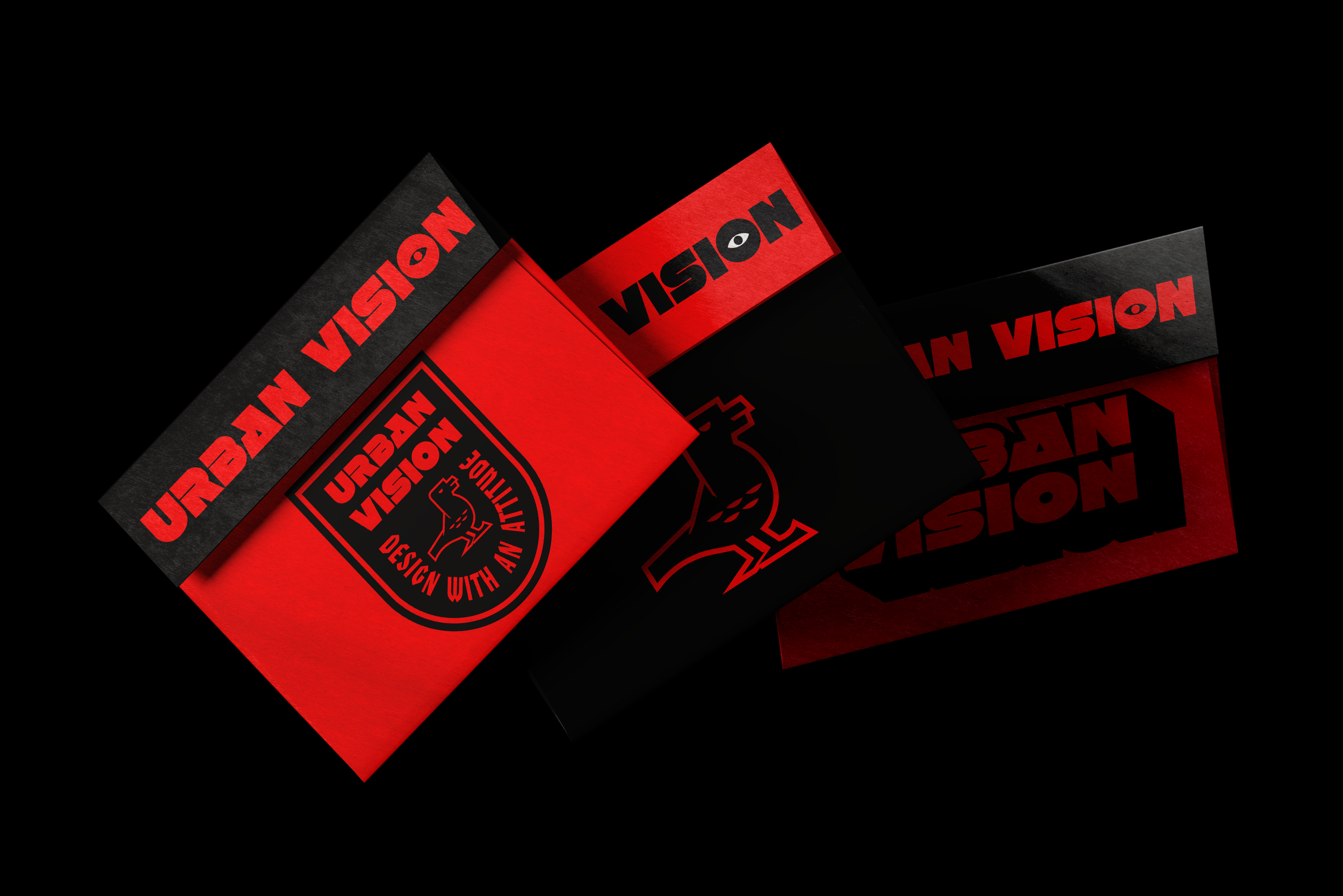
STRATEGIC DISRUPTION
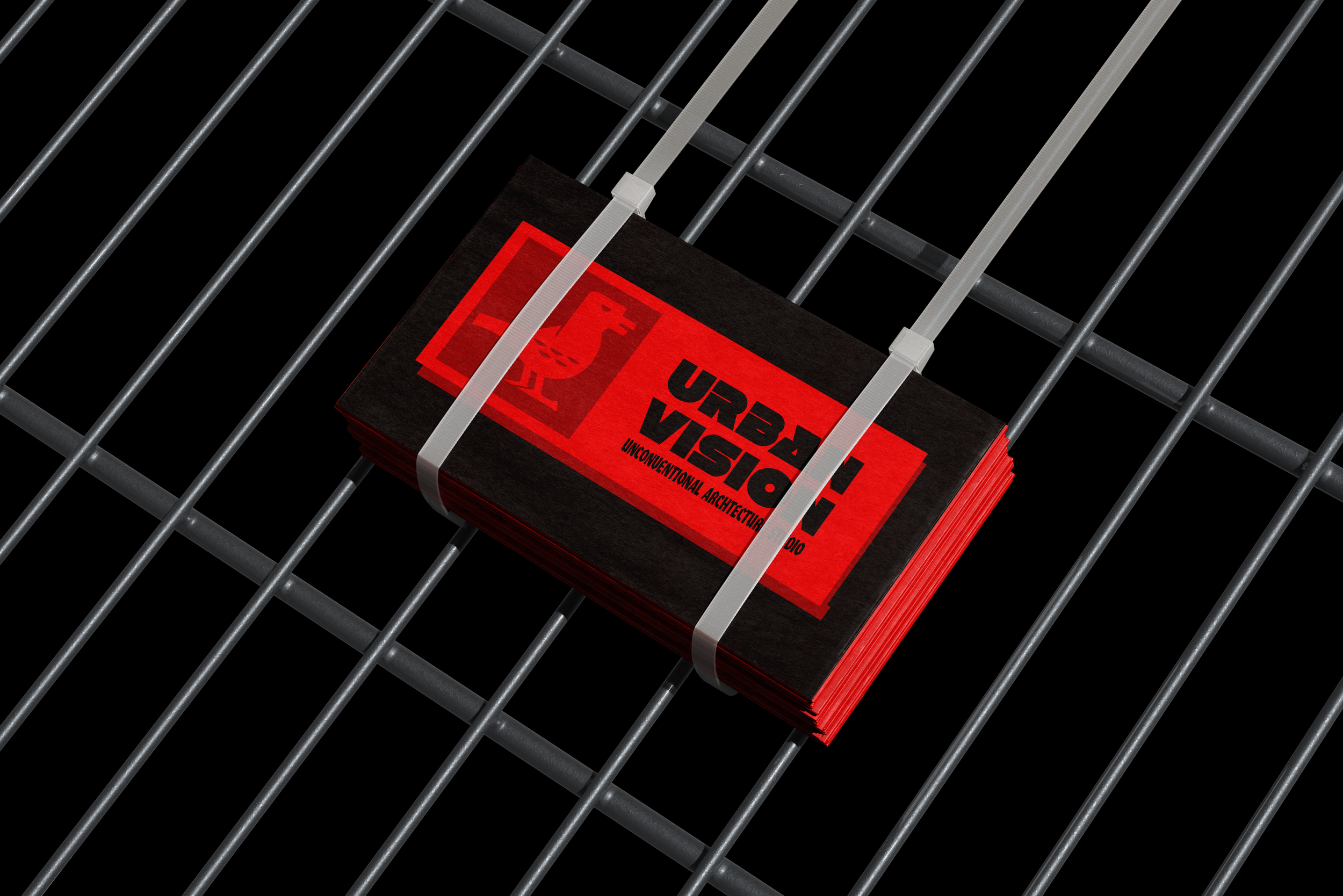
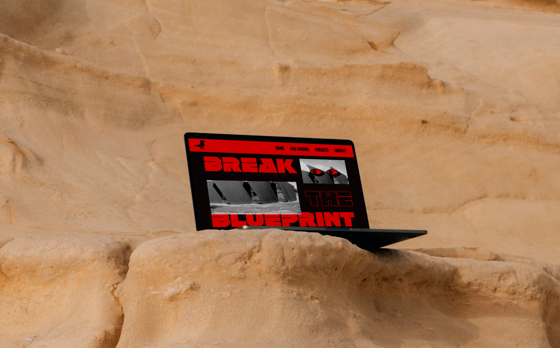
To bridge the gap between "rebel" and "architect," the strategic execution focused on tactile, real-world applications. It wasn't enough for the brand to look good on a screen; it had to feel like a physical part of the urban environment. This led to experiments with "guerrilla" touchpoints such as business cards zip-tied to industrial grates and transit ads that mimic high-contrast warning signs. By treating the brand assets as structural elements rather than just marketing materials, we created a sense of permanence and "built" authority. This approach ensured that every interaction with the brand felt intentional, structured, and slightly defiant.
intelligence in the grid
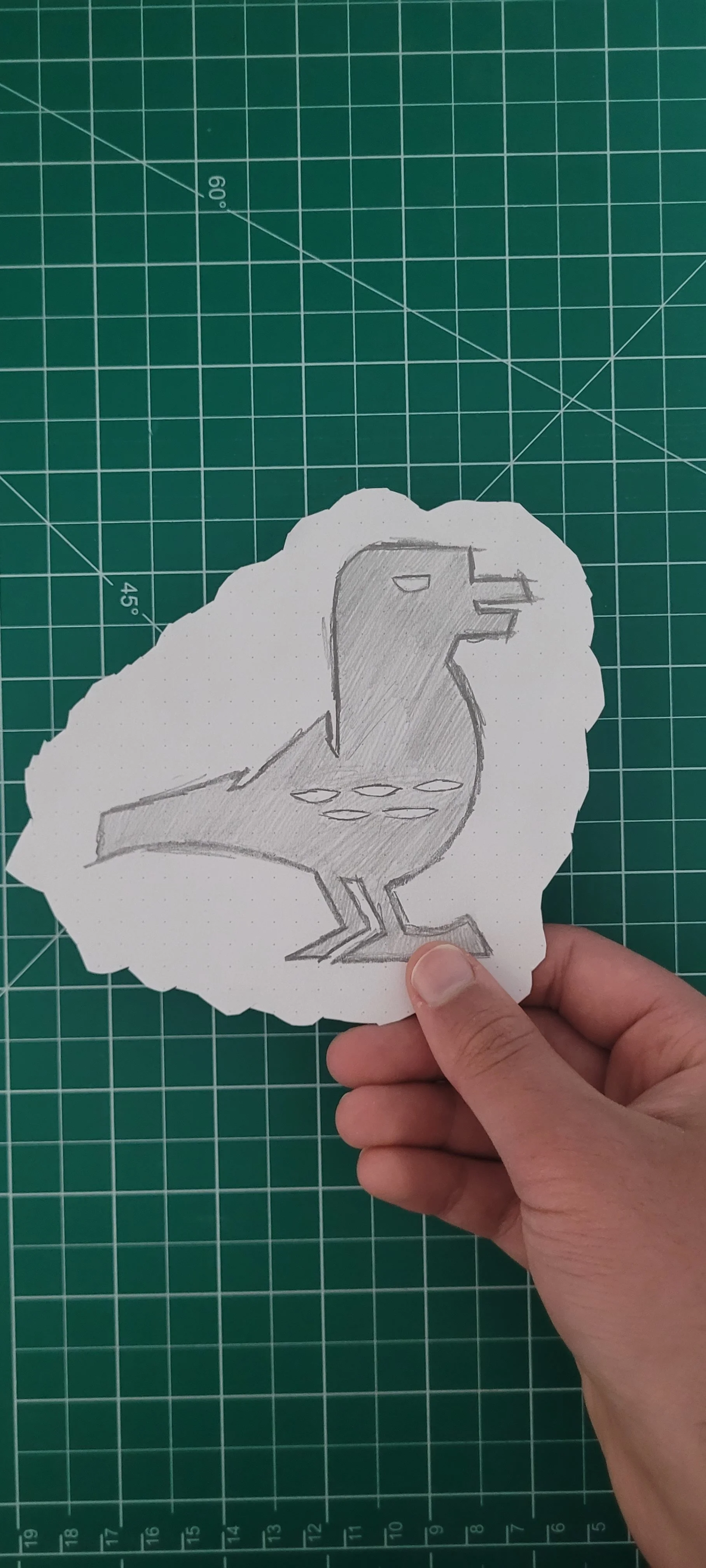
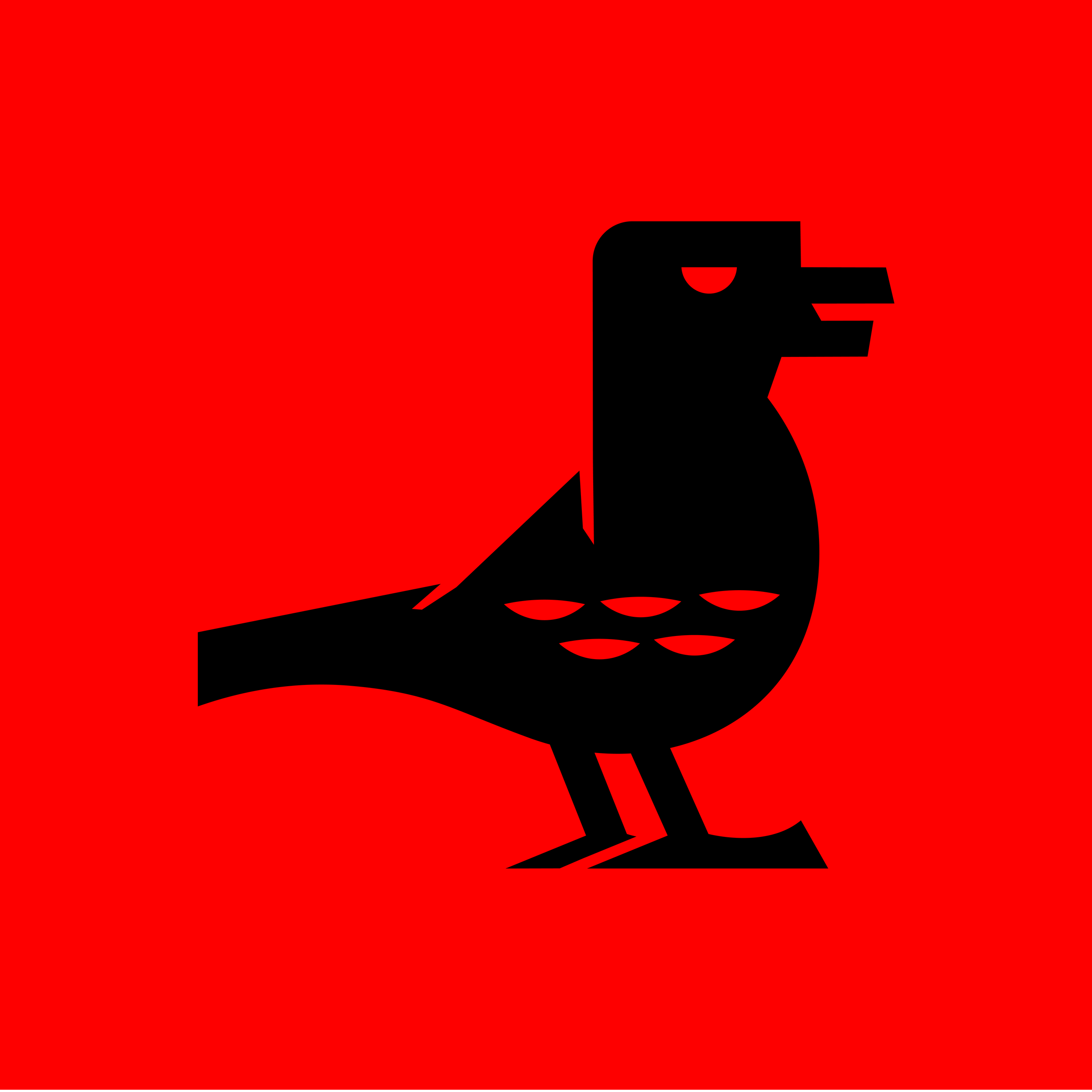
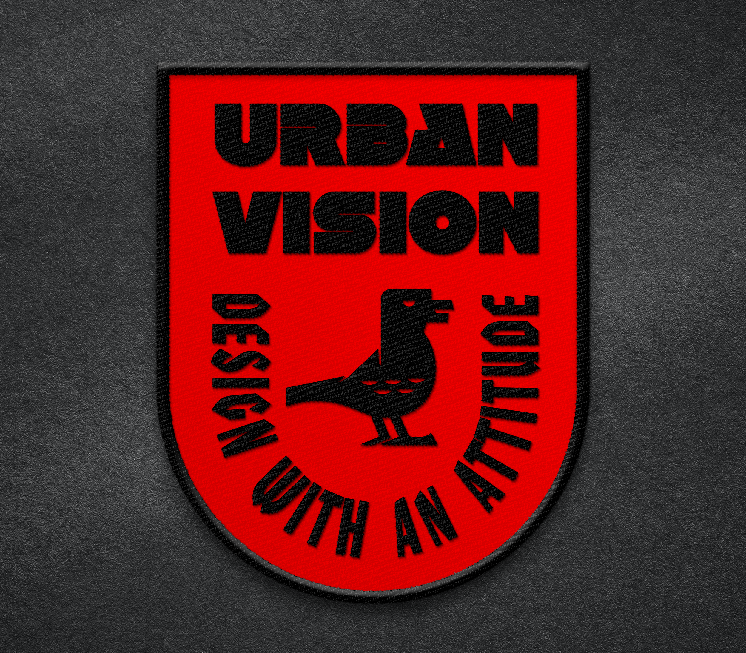
The visual direction was anchored by the Raven: the ultimate urban survivor. Known for its high intelligence and rebellious streak, the raven is the perfect mascot for a studio that navigates complex city systems. I integrated sharp, geometric angles into the logomark to mirror the "built" environment, ensuring the bird felt like a structural blueprint. This geometric precision allows the mark to scale perfectly, from a tiny "seal of approval" on a technical drawing to a massive, stencil-style mural on a construction site.
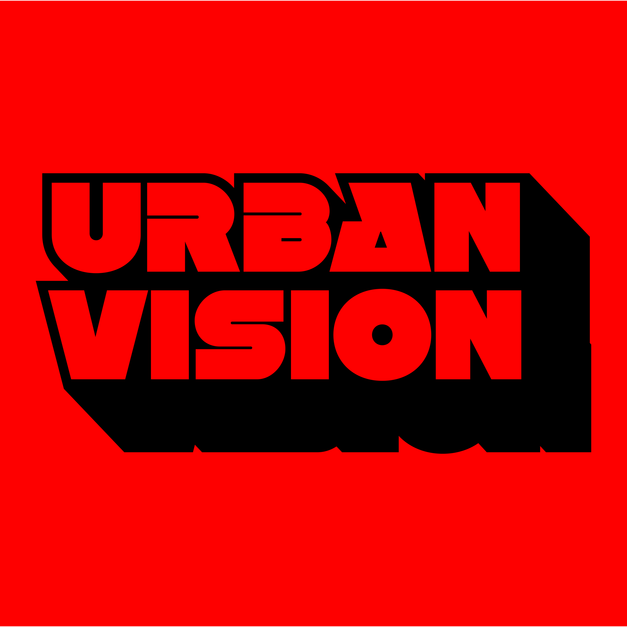
Typography was used as a tool for "urban takeover." By utilising heavy, overlapping block type and stencil-inspired layouts, the identity physically represents the idea of "Breaking the Blueprint." The text is often pushed to the edges or overlapped by imagery, suggesting that the studio’s vision is too big to fit within traditional margins. The final result is a brand that doesn't just follow the city’s rules, but instead rewrites them, proving that architecture branding can be as bold, smart, and defiant as the buildings it creates.