
Food Photography London (FPL)
PROJECT: Visual Identity Design
DELIVERABLES: Logo/Website/Merch
TIMELINE: 3 WEEKS
Food Photography London was one of the very first brands I ever designed for. That project marked the start of my journey into branding - before I had a formal process, a creative system, or the confidence I have now. And while the original branding I designed didn’t quite hit the mark, it planted the seed for everything I’ve learned since.
Now, with years of experience behind me, I’ve returned to FPL - not as a client commission, but as a concept project. I wanted to imagine what the brand could look like today, using the strategy, storytelling, and creative thinking I’ve built up over time. This case study is a reflection of growth and a celebration of how far both the brand and I have come.

FROM GOOD TO BOLD
Food Photography London has built a reputation on its bold, flavour-packed visuals. But the challenge I saw was this: how can we create a brand identity that amplifies that visual power and makes it instantly recognisable?
I approached this as a creative opportunity - to build a brand that could carry the same energy as the photography itself. While there wasn’t a formal brief, I shaped my own: create something expressive, scalable, and versatile enough to support both the craft and personality behind FPL. The goal was to elevate, not reinvent — to design a brand identity that does justice to the visuals it's built around.

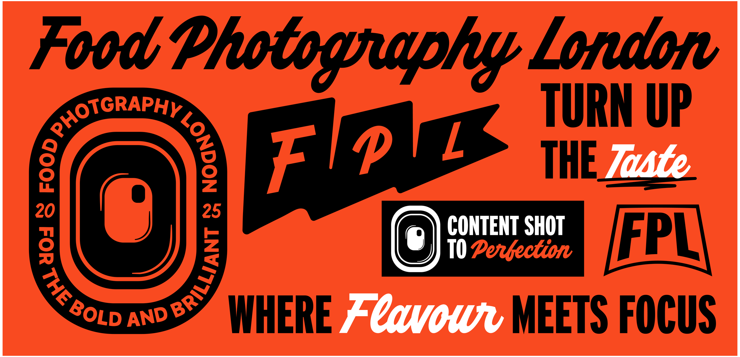
where Flavour Meets Focus
I built this concept around the boldness of FPL’s food - the textures, the flavours, the unapologetic attitude - and the streetwise confidence of its photography. Instead of relying on tired symbols like cameras or chef hats, I looked for more indirect ways to show what the brand stood for. The burger-flag-inspired “FPL” logomark became a standout piece — simple, iconic, and rooted in food culture without saying the obvious.
From typography to layout, everything was designed with punch and clarity in mind. I used KC Lager for its retro script energy - bold enough for headlines, but stylish enough to feel ownable. Paired with a sharp sans serif and a fiery colour palette, the system feels like hot sauce on brand. Every decision was about making the brand feel as tasty as the food it showcases.
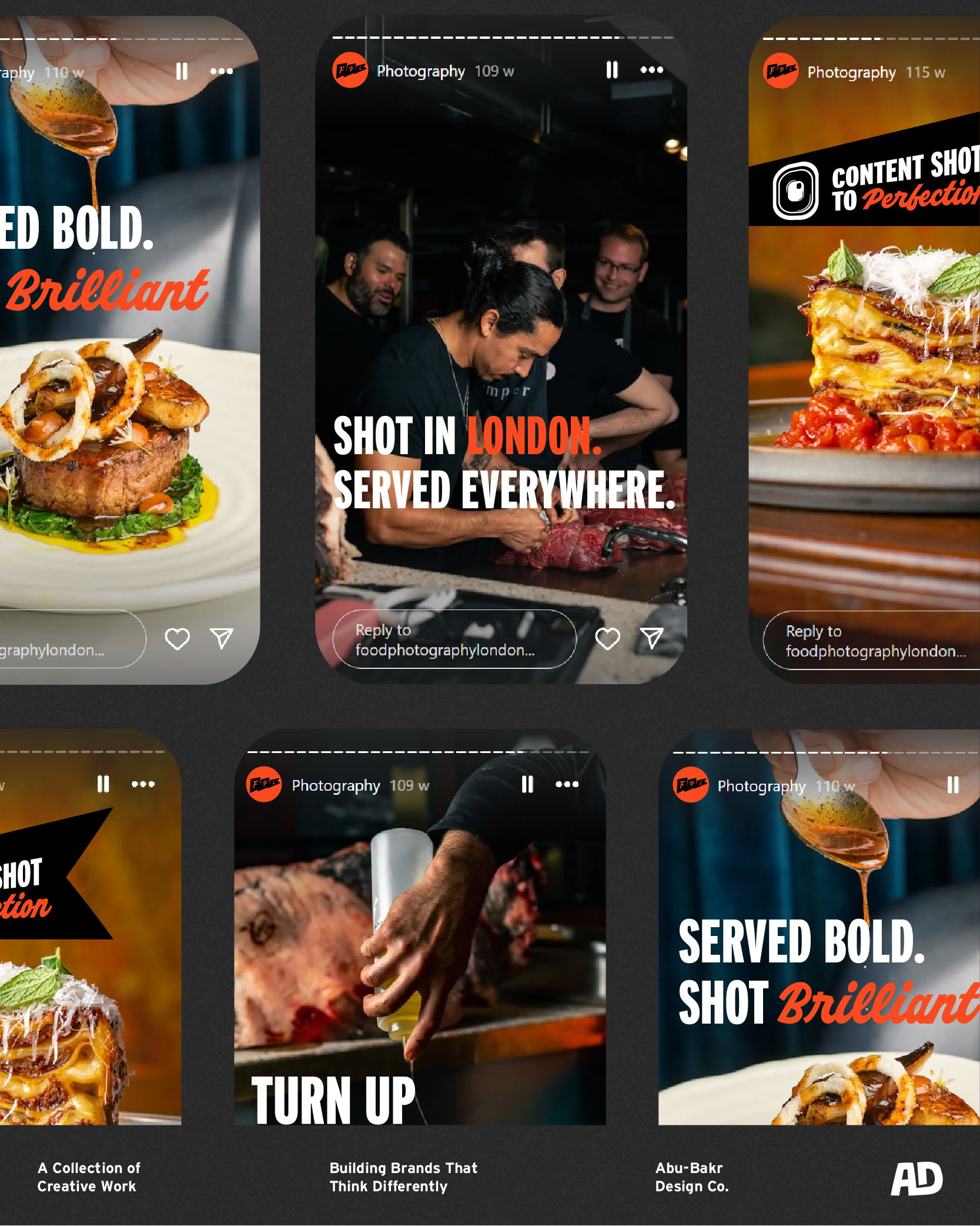

From Lens to Launch
The logomark suite became a playground for brand storytelling - from the lens-inspired badge to the stamp-like insignias, each visual asset was built to be memorable and multifunctional. I imagined how these elements could work across packaging, posters, studio walls, and social. The slogan work added the final punch - short, bold statements that captured the brand's energy without saying too much.
This project wasn’t about design for design’s sake. It was about respect - for the client, for the craft, and for my own growth. I wanted to show what’s possible when you combine strong strategy with sharp design. And ultimately, to prove that even failed projects can be the spark for something brilliant.