
snap chocolate
PROJECT: Visual Identity Design
DELIVERABLES: Logo/Packaging/Merch/Signage
TIMELINE: 3-4 WEEKS
Snap is a Swiss chocolate concept brand made for kids aged 5–12, with one clear mission: to make chocolate feel like an adventure. Designed to be bold, playful, and full of imagination, this project was a chance to push the boundaries of typical confectionery branding. It wasn’t just about designing a logo or packaging-it was about building a whole experience that could spark joy, curiosity, and loyalty from a young audience.
What made this project unique was its balance of storytelling and strategy. While the brand needed to be fun and exciting for kids, it also had to feel intentional and clever-something that could be taken seriously by parents and retailers alike.

SWEET, BUT NOT SAFE
Many kids’ chocolate brands play it safe-relying on bubbly typefaces, chocolate brown backgrounds, and cartoonish mascots. But Snap needed to feel fresher and more adventurous. One core challenge was designing a visual identity that stood out in the confectionery aisle without leaning on the typical tropes. That meant avoiding the overused white-outlined, puffy lettering and finding a different way to capture playfulness.
Another key constraint was resisting the urge to use chocolate brown as the main color. While it’s a natural association, leaning too heavily on brown can feel tired and predictable. The challenge became finding new visual language that still felt relevant to chocolate but with an unexpected, energetic twist. The identity needed to be loud, joyful, and full of character-without looking like everything else on the shelf.

PLAYFUL with a purpose
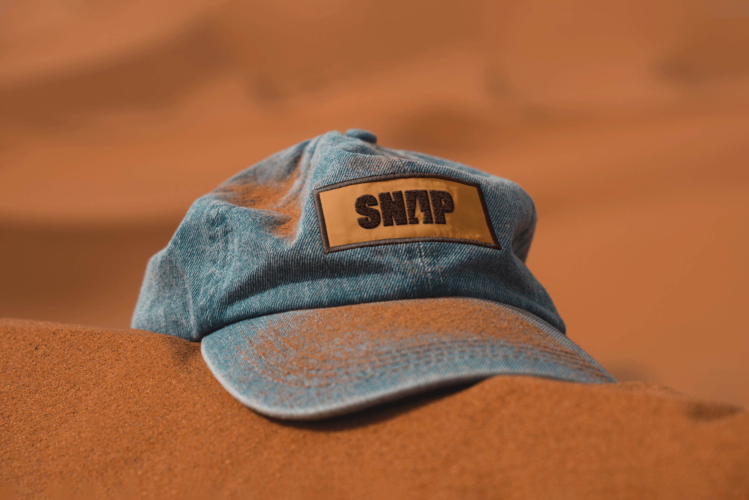
The visual direction for Snap was built around the idea of a sensory adventure. I integrated a lightning bolt into the "A" of the logo to represent a spark of excitement - a moment of joy when a kid bites into their favorite treat. Bold, chunky typography gives the brand presence and playfulness, while remaining clear and legible even at smaller sizes. The goal was to make something that looked as fun as it tasted.
Color played a huge role in breaking category norms. I chose zesty greens and energetic oranges not only to avoid the standard chocolate palette, but to evoke the feeling of outdoor play and wild exploration - like running through a rainforest or climbing up a treehouse. The entire identity leans into this sense of imaginative freedom, proving that chocolate branding doesn’t have to follow the rules to win hearts (and taste buds).