
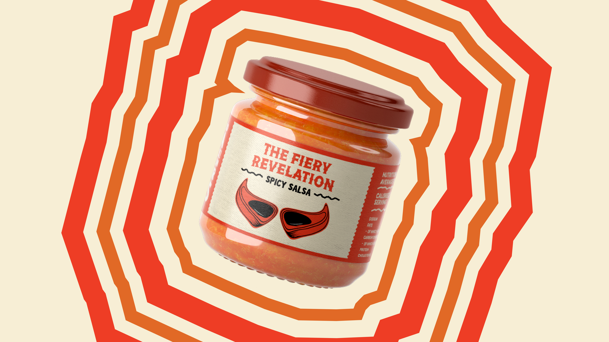
Holy Mole
PROJECT: Visual Identity Design
DELIVERABLES: Logo/Packaging/Advertising
TIMELINE: 1-2 WEEKS
This project set out to explore packaging design through the lens of bold flavor and cultural energy. The challenge was to create a fresh, stand-out identity for a salsa and guacamole brand; one that could live on crowded supermarket shelves and immediately spark curiosity. Unlike my typical brand identity projects, this was a chance to dive into packaging as the hero touchpoint, where typography, illustration, and layout all had to work together in seconds to capture attention.
What made this project unique was the opportunity to push beyond minimalism and embrace vibrancy. Instead of playing it safe with clean, subdued aesthetics, I leaned into a more radical, expressive direction that reflects the personality of the product itself. This case study unpacks how I translated that raw flavor into design, navigating both creative freedom and structured problem-solving.

bolder than the rest
The core problem was visibility. Salsa and guacamole packaging often blends into a sea of green and red tones, making it difficult for one brand to own a truly memorable space. The “client” direction emphasized creating something eye-catching and premium, but without losing a sense of authenticity and approachability. In other words, the design had to work hard at both extremes: stand out and stay true.
Constraints came from the “retail reality” as well. The packaging needed to function across multiple formats while retaining clarity of information — flavor type, ingredients, and product name had to remain instantly legible. It was also important to balance hierarchy so the bold visuals didn’t overshadow the essentials. This tension between storytelling and practicality framed the design challenge from the start.
turning up the flavour
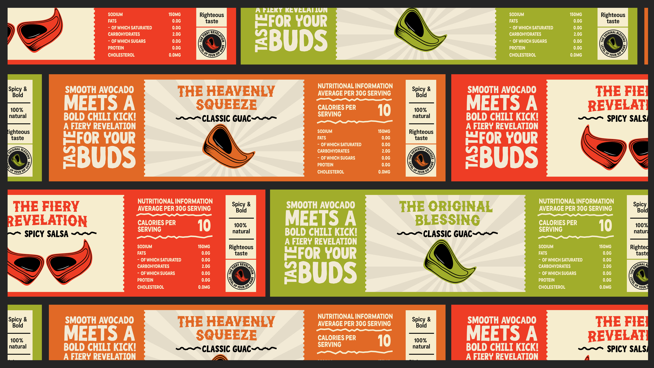
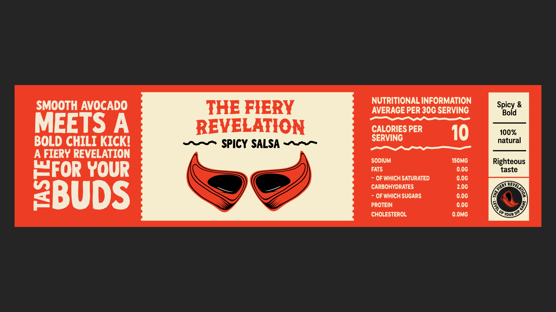
The conceptual direction leaned into the idea of freshness and fiesta energy — packaging that feels like it’s celebrating flavor rather than just containing it. I drew inspiration from Latin street markets, vibrant hand-painted signs, and the playful energy of food culture. The typography was chosen to feel dynamic and handcrafted, echoing the personality of something made fresh, while the color palette pushed beyond the predictable red/green into bolder contrasts that signal individuality.
Every element was designed with intention. Large, energetic type created hierarchy and shelf impact, while supporting illustrations and layout choices gave rhythm and flow to the design. This approach ensured the packaging didn’t just “sit” on the shelf, but actively invited the consumer in. The choices connect directly to the brief’s demand for visibility, transforming constraints into opportunities for more expressive, flavorful branding.

The Final Garnish
The final design approach blended bold expression with clear communication. By combining oversized typography, layered textures, and dynamic shapes, the packaging delivers immediate impact while still guiding the eye toward key information. This balance gives it both personality and functionality — essential for a product competing in busy retail environments.
Ultimately, the project demonstrates how packaging can become more than a container — it can be a storytelling device. By rooting the design in cultural cues and energetic expression, the final outcome positions the brand as something fresh, memorable, and unmistakably bold. It’s packaging that doesn’t whisper from the shelf; it speaks loud and clear.
