Zaha Hadid
PROJECT: Typographic Poster Design
DELIVERABLES: Custom Typography/Poster Design
TIMELINE: 4 WEEKS
Zaha Hadid is a renowned architect known for her pioneering approach to designing her buildings. In a space where architecture traditionally involved very blocky or sharp structures, Hadid challenged this notion by curving her building designs, giving them a wavy, fluid quality that resembles Arabic calligraphy. I worked on an independent student project in which I was tasked with creating a typography-led poster design that communicates her personality and unique style.
This student project I did was a typographic exploration of the intersection of architecture and graphic design. Created as a tribute to the "Queen of the Curve," my goal was to translate Zaha Hadid’s revolutionary approach to architecture, bringing fluidity and motion into a static, two-dimensional format. This project wasn't just about creating a commemorative poster; it was about deconstructing the essence of structural design and rebuilding it through type.
ARCHITECTING THE ALPHABET
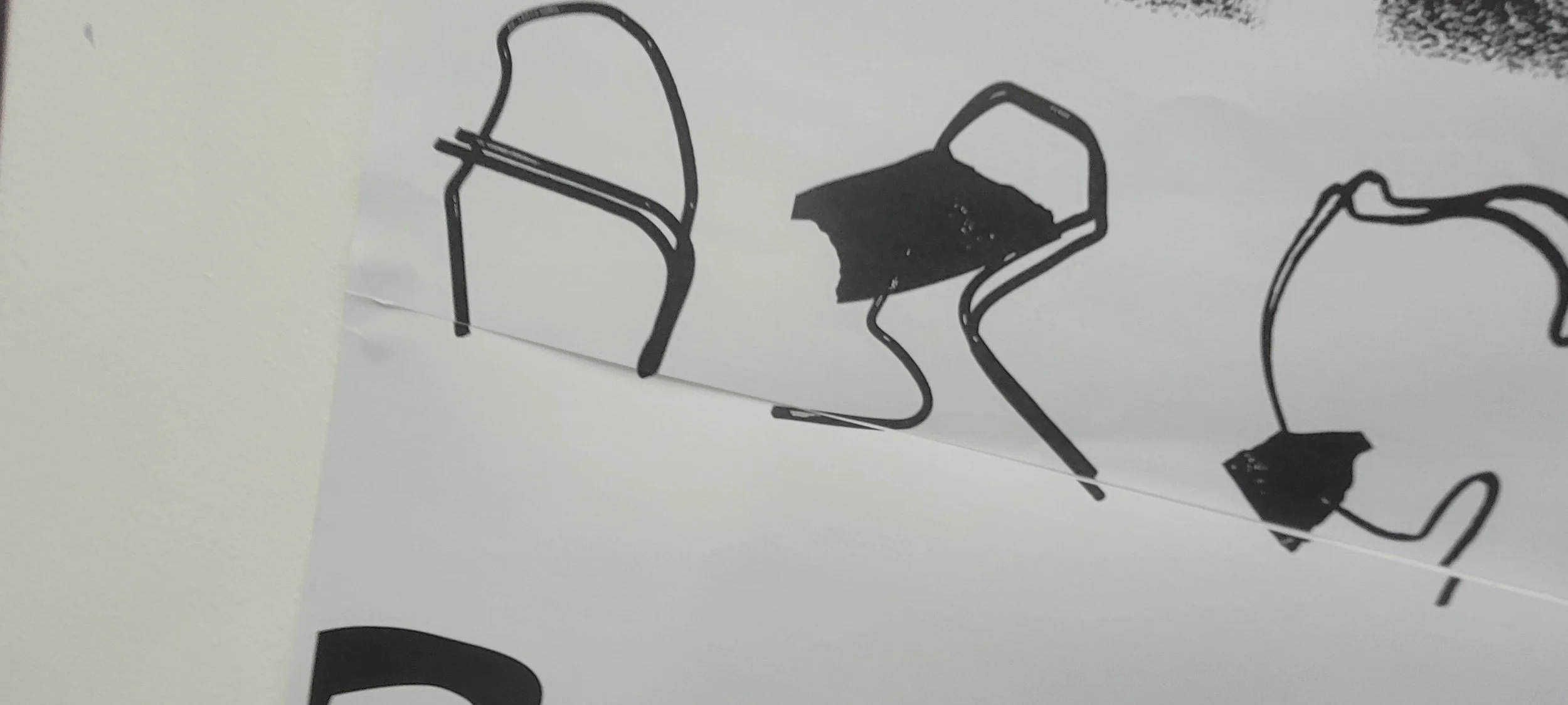
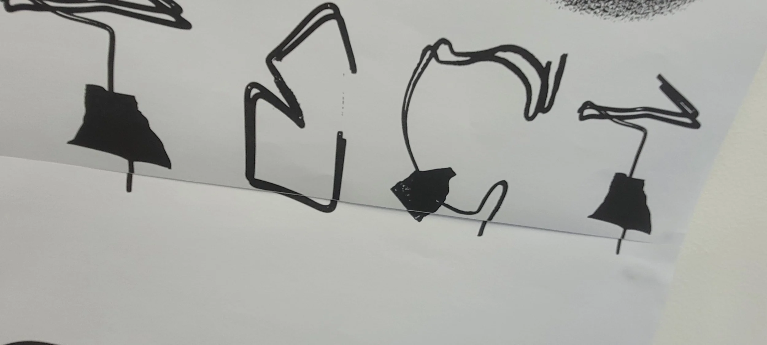
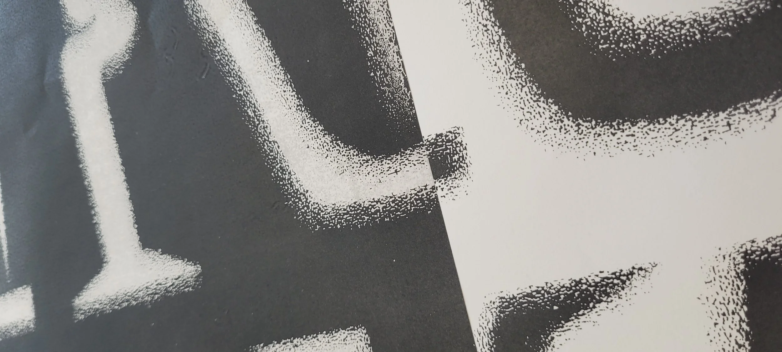
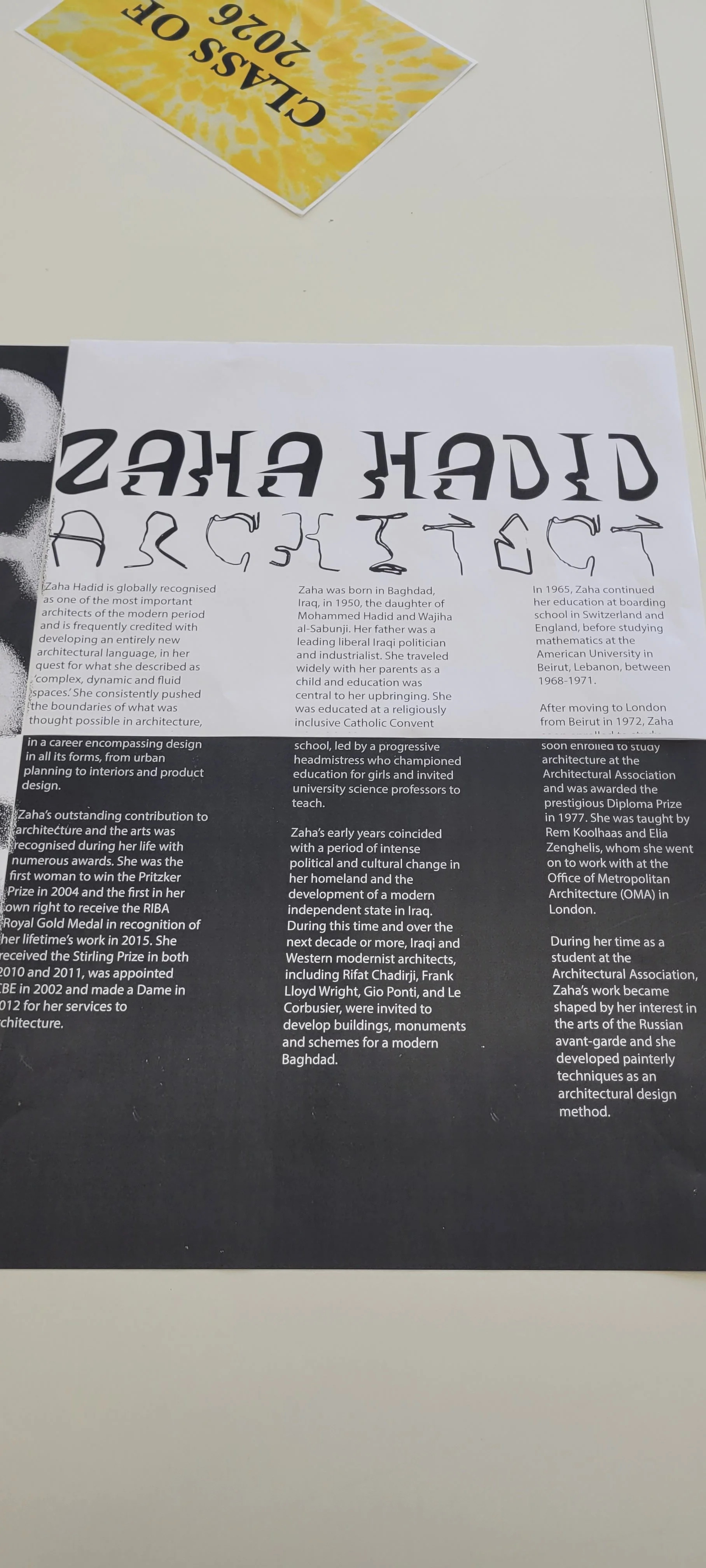
The core of this project was a commitment to physical experimentation. Rather than jumping straight to digital tools, I wanted to experience the structural challenges Hadid faced in her own work. I began by physically constructing the word "Architect" from unconventional materials, such as paperclips and green metal wire.
This analogue prototyping of bending materials and the use of hard shadows in photographs allowed me to understand how tension, weight, and curvature interact, forming the DNA of a custom typeface that mirrors the sweeping, skeletal forms of Hadid’s buildings.
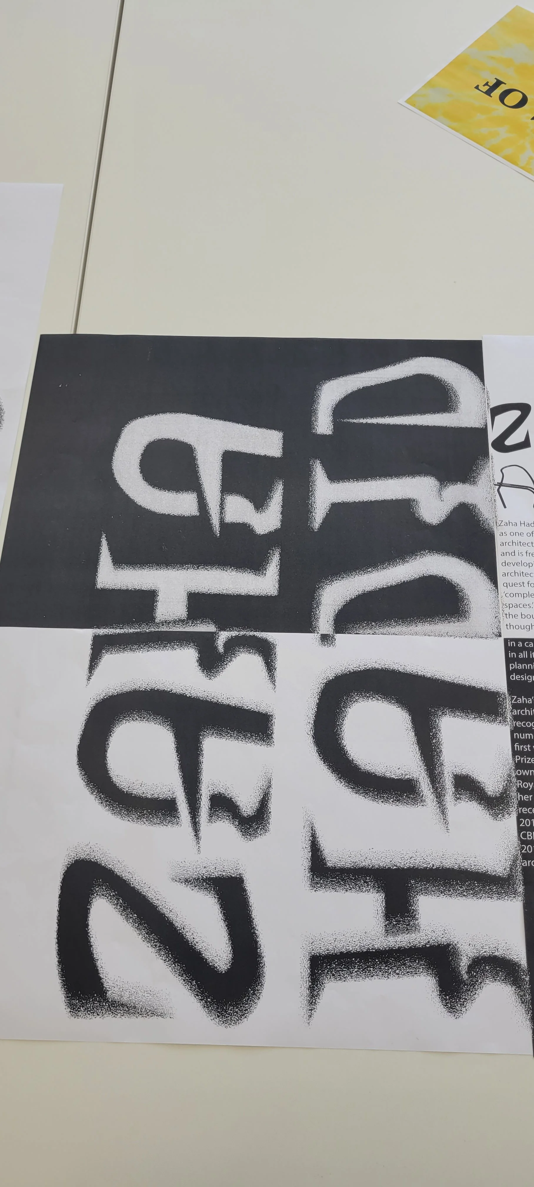
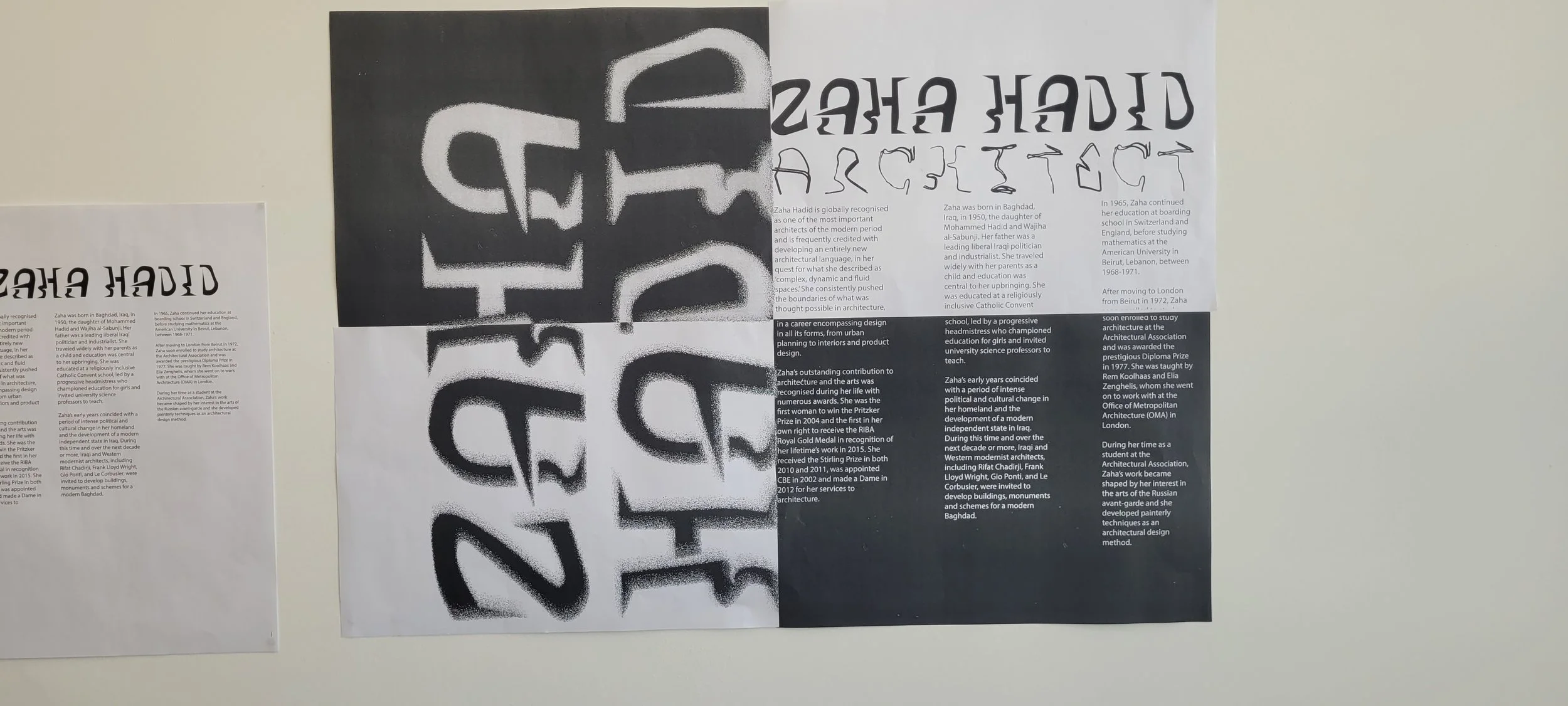
THE POWER OF the DUAL PERSPECTIve
A key strategic decision was to present the work as a diptych. In architecture, a building is never viewed from just one angle; it is an experience of shifting perspectives. By designing two separate posters that function as a single, cohesive unit, I played with the idea of continuity and interruption. The diptych format forced the typography to "travel" across the physical gap between the frames, mimicking the way Hadid’s structures seem to flow through space and defy traditional boundaries.
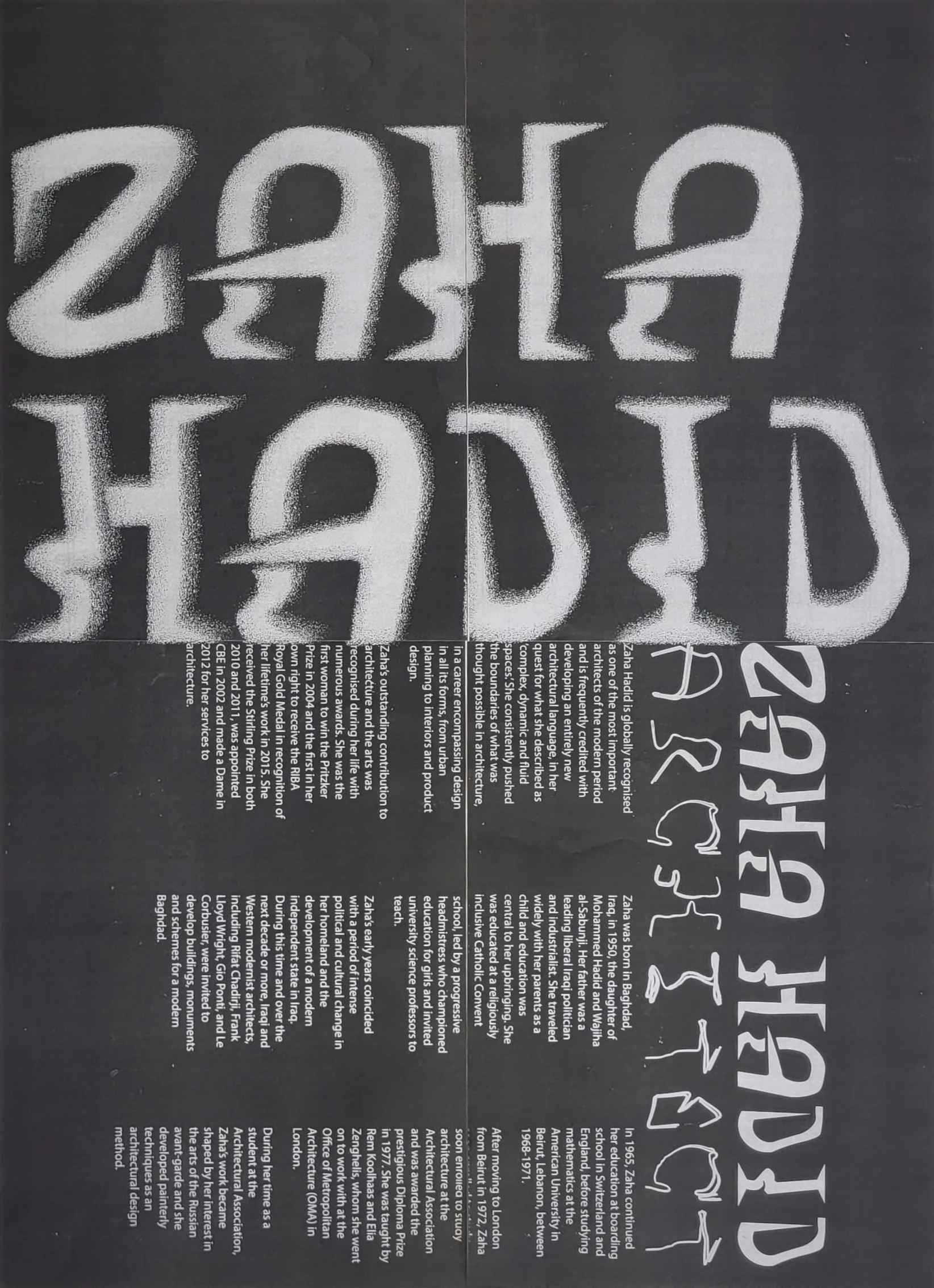
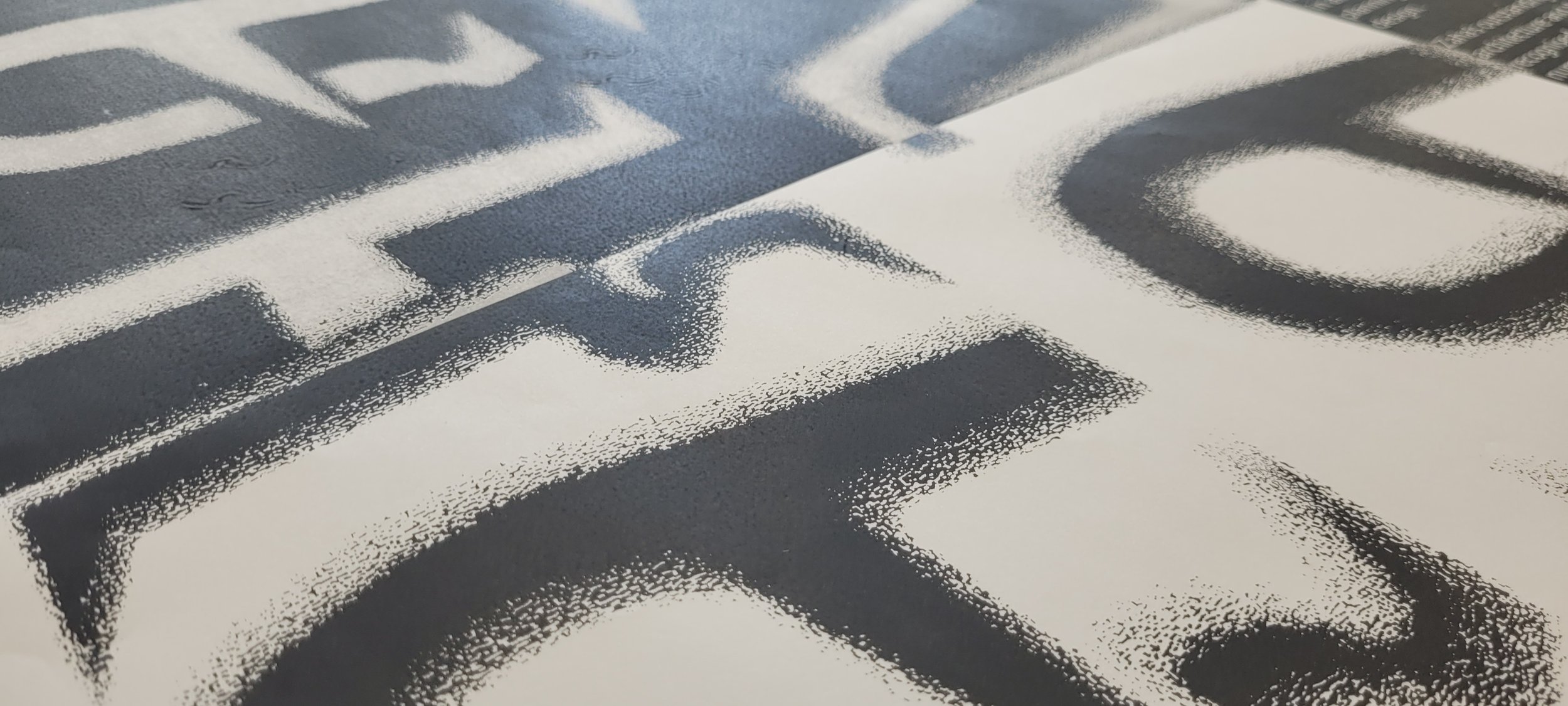
CONTROLLED CHAOS IN PRINT
The production process became a final layer of rule-breaking. To capture the monumental scale of architectural work, I utilised a tiling method for large-scale printing. By intentionally inverting pages and playing with high-contrast layouts, I introduced a sense of "visual energy" that standard printing would lack. These quieter moments of technical experimentation, which involved shifting the alignment and challenging the printer's output, resulted in a final piece that feels as dynamic and unpredictable as the structures that inspired it.
By stepping away from the screen and building type by hand, I was able to bridge the gap between two-dimensional graphic design and three-dimensional spatial thinking. This project serves as a reminder that when we treat typography as a physical structure rather than just a digital asset, we can create work that feels truly structural, intentional, and unapologetically bold.