munch mania menu launch
PROJECT: Menu refresh and launch
DELIVERABLES: Menu Refresh/Photo Editing
TIMELINE: 3 Weeks
Project Type: Professional Creative Work
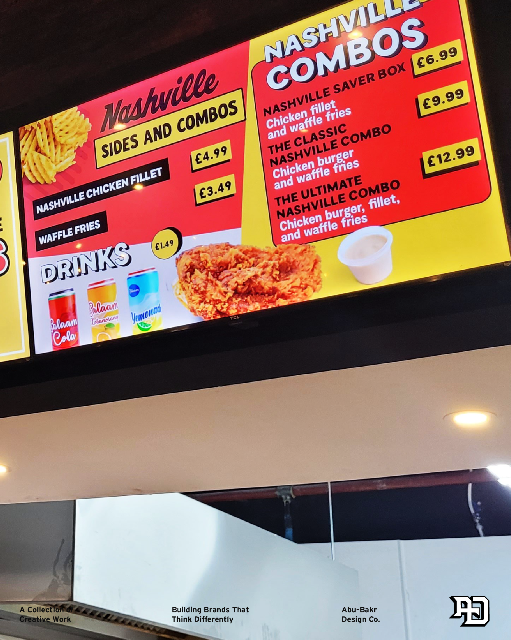
Munch Mania is a new restaurant launching in London, United Kingdom, with a mission to share their crispy and mouth-watering Nashville burgers with everyone. Since they’re located within a food court alongside many competing businesses, they needed a menu that would instantly catch people’s attention, stand out from the other competing menus, and convey their brand’s visual direction. This was one of my first times working on a menu design project with a client, and it presented many opportunities and challenges to consider how to organise specific elements on each screen, to avoid customers missing key details such as pricing, or misreading the title name.
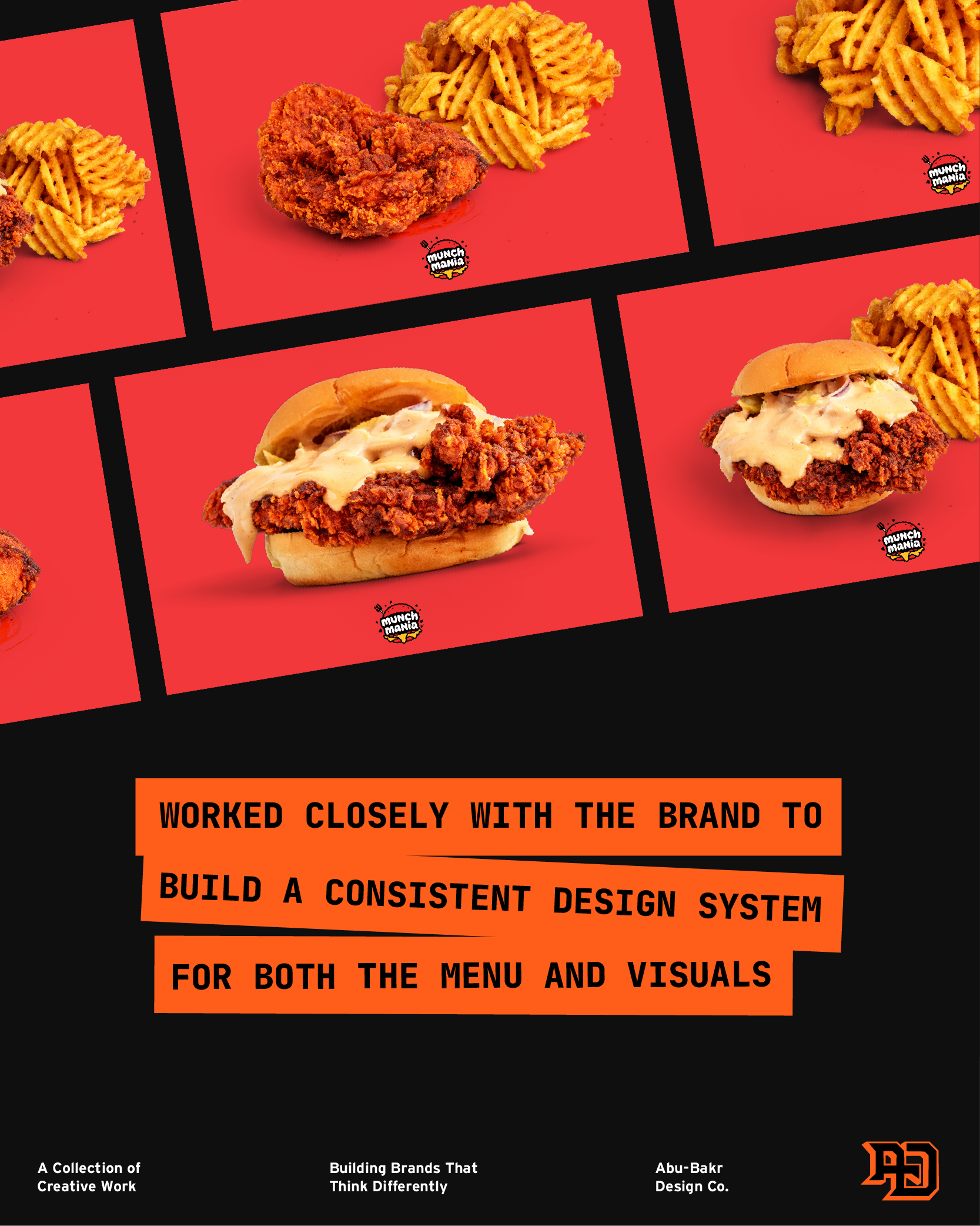
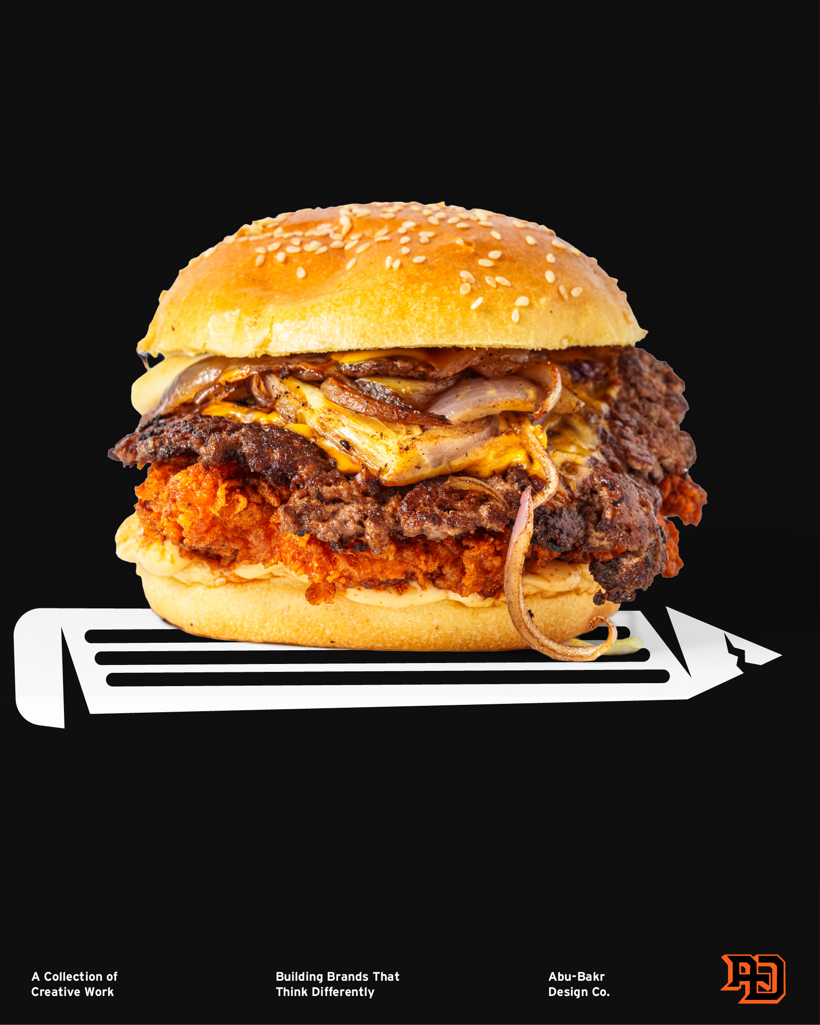
BUILDING A MENU THAT MAKES MOUTHS WATER
After several discussions with the client about the visual direction, we were able to rule out several generic elements that we did NOT want for Munch Mania, overly designed title fonts, colours that blend too much, or poorly angled visuals. The key was to instead utilise the colours from their branding to design a consistent visual system that could adapt effectively to all of their menu touchpoints.
For the title design, I chose to use hand-drawn fonts that visually convey the level of effort that goes into cooking the burgers, and specifically, using different fonts for the word “Nashville” to highlight it as a signature dish to consumers without appearing or feeling overused.
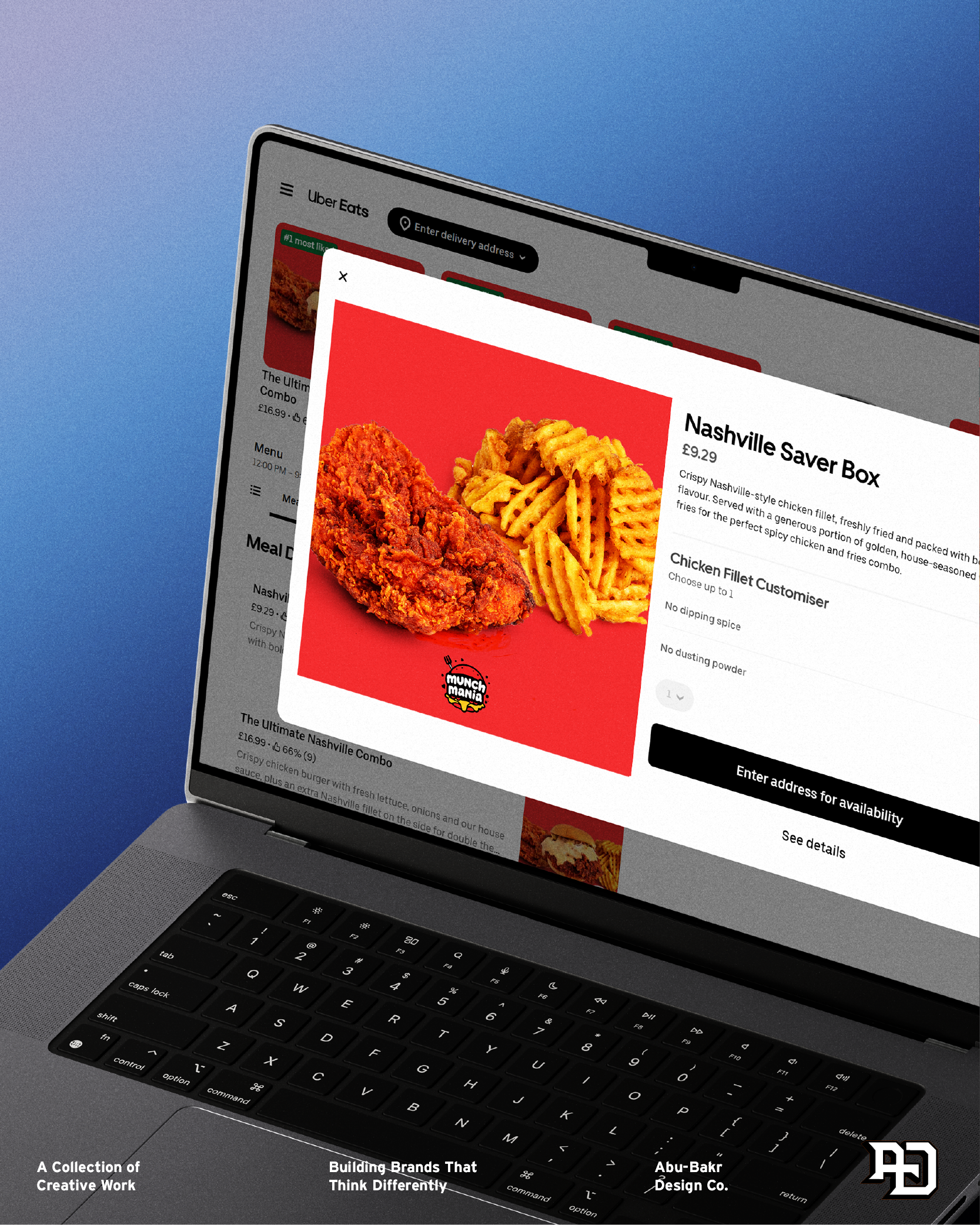
BUILT TO ADAPT BEYOND only ONE SCREEN
After successfully launching the first version of the menu, I was able to continue providing value to the client by helping them adapt their menu for online platforms such as Uber Eats. This mainly involved prioritising each of the visuals for the menu items, ensuring that they appear both in high quality and stay visually consistent with the brand’s colour guidelines.
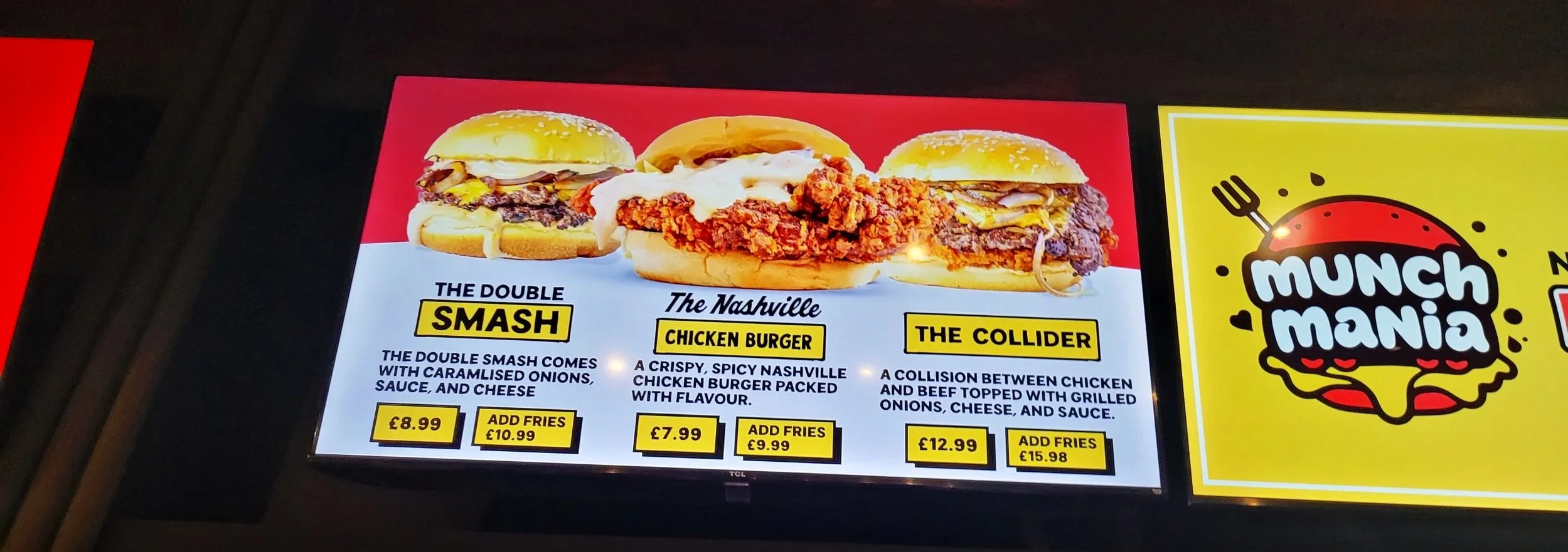
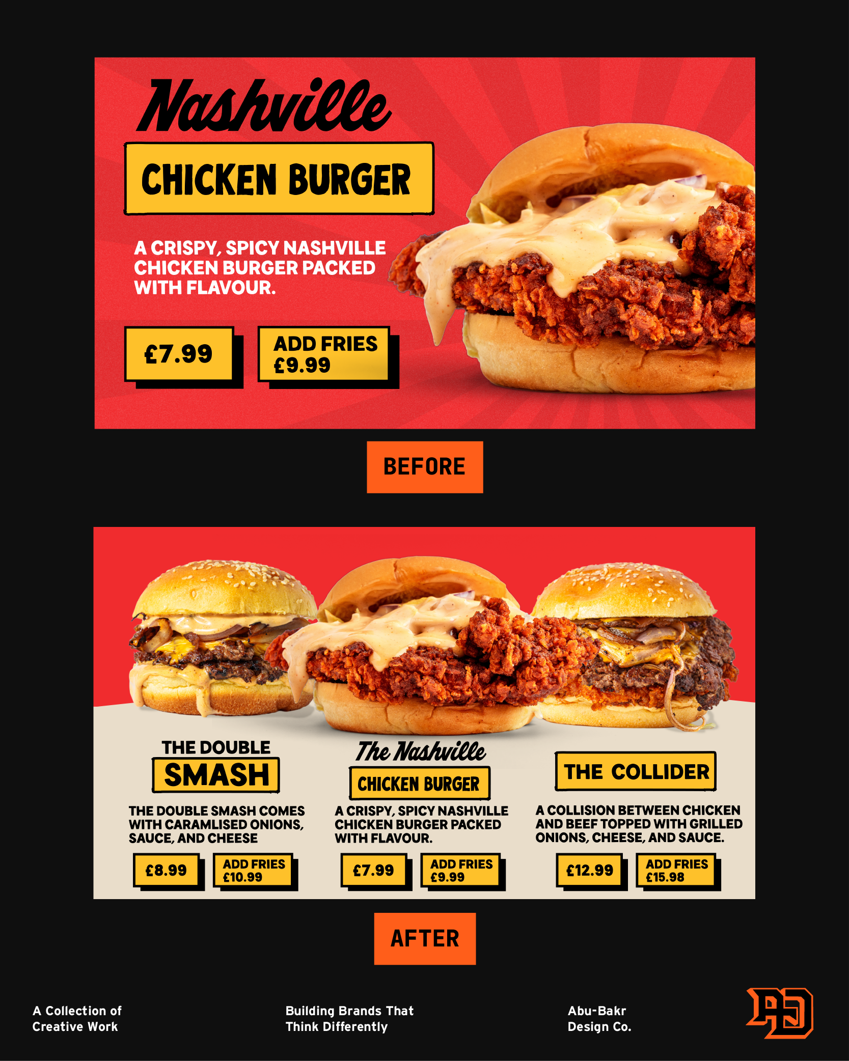
One of my favourite parts of this project was being able to continually work with this client to adapt their menu. A few months ago, I helped redesign one of the boards from their first menu since they were expanding with two new burger items. This meant having to reconsider the initial layout which was built to highlight one signature item, but now had to still keep that same feeling clear alongside other burgers. The final result I shared allowed me to showcase these new burger items, each utilising the established title design system in their own way, while allowing the signature nashville burger to stand out to customers.